A consistent art style—or a consistent artistic practice—is a necessary pretext for a prosperous career as an artist. However, finding a unique and personal style is not something that falls from the sky, nor does it mean that you have to create the same thing repeatedly. In this article, we will discuss six proven strategies for how established artists created consistency in their oeuvre or developed a unique and intriguing style that made them recognizable and successful.
If we look at the most successful artists today, one can notice they all have a very distinctive and personal style or consistent body of works. As you might have heard, galleries and collectors are looking for artists with a clear vision, identity, or visual style—for commercial purposes, but also, from a critical point of view, these requirements are valid. To achieve high-end quality and in-depth expertise in a topic, technique, issue, or medium, we need to focus and explore it thoroughly—and this takes time and repetition.
However, it is also important to realize that these successful and consistent artists are not one-trick ponies. On the contrary, it would not only be very boring to create the same thing repeatedly, but it would also be rather dull to follow, collect, or represent an artist with the same works, year in and year out, with nothing new to discover. So besides being recognizable, you must also be versatile as an artist—a tricky play of balance between change and consistency. So the good news is we don’t have to pin ourselves down to one particular medium, subject, style, or technique. If people say you have to, they are wrong! However, being all over the place and hopping from one thing to the next won’t help us either—that’s not the versatility we are looking for.
So, let’s illustrate this play of balance by discussing some real-life examples of successful artists mastering consistency while maintaining an intriguing development and versatility throughout their oeuvre. By doing so, we have identified six strategies you can implement in your artistic practice, so you can develop your style and recognizability, elevate your artistic practice and increase your chances for success. Please note how most of these artists combine various strategies throughout their artistic practice, creating consistency on different levels, resulting in more possible connections with their previous work when taking on a new series or project.
1. Technical Consistency
We’ll start with the most straightforward strategy from our list; technical consistency—dedicating your life and career to a single medium, or even more, to a single technique within a particular medium. It is clear that finding a personal and rather unique technique is a great way to achieve consistency in your oeuvre, but also versatility, by exploring the possibilities and limitations of the technique in question.
However, finding a unique and personal technique is easier said than done, especially in an era where it often seems as if everything has been done yet. So let’s look at some successful artists who succeeded in finding a personal technique, resulting in technical consistency.
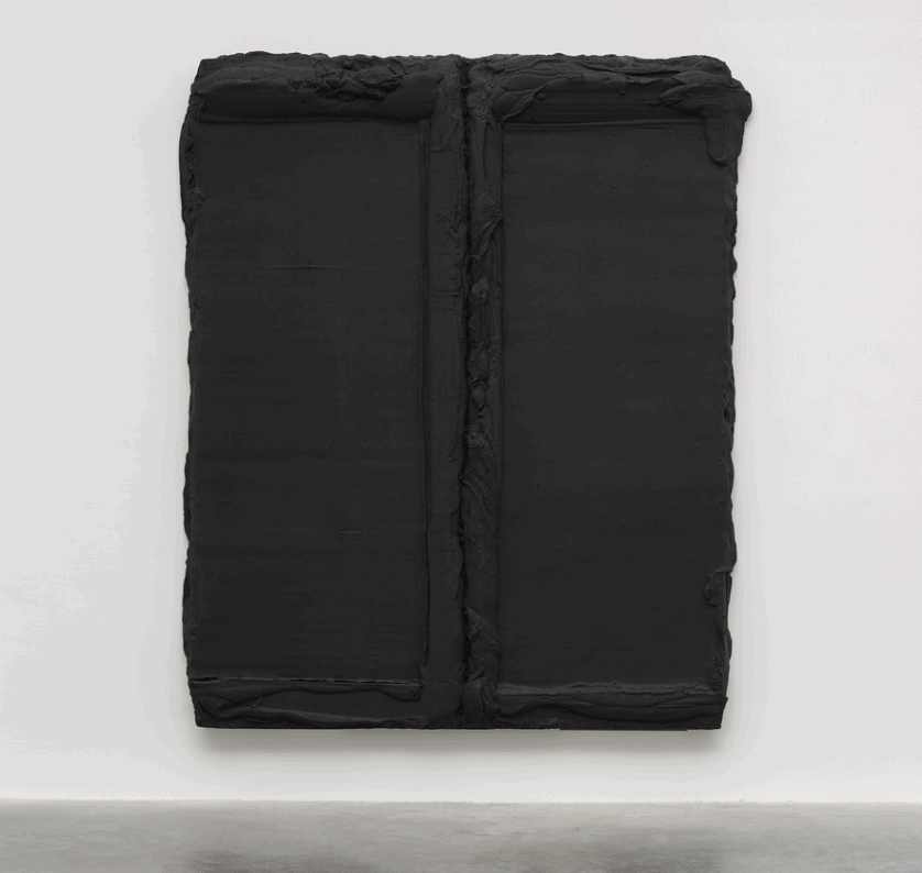
Case Study I: Bram Bogart’s Unique Mixture of Paint
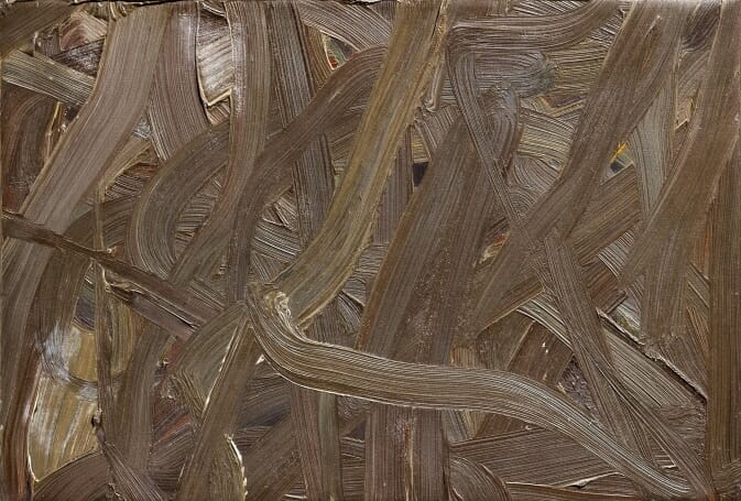
Bram Bogart’s abstract paintings are marked by his ongoing exploration using a unique mixture of paint he developed throughout his career. He boiled and riped poppy oil with pigment powders and zinc white and mixed it with water shortly before applying it to the canvas. Bogart explored the possibilities and limitations of his process, resulting in a varied abstract yet recognizable oeuvre, ranging from textural monochromes to colorful geometrical compositions to abstract landscapes.
Bram Bogart, Rode Rouge, 2008. Home made paint (pigment, oil, glue, watercolour) on artist made board / canvas — 66 1/10 × 55 1/10 in | 168 × 140 cm. Courtesy Vigo Gallery.
Bram Bogart, Een Kleur, 2005. Mixed media on board — 32 3/10 × 38 1/5 × 5 9/10 in | 82 × 97 × 15 cm. Courtesy Bernard Jacobson Gallery.
Bram Bogart, Juli, 2002. Oil and water color on wood panel — 20 × 20 × 4 in | 50.8 × 50.8 × 10.2 cm. Courtesy Galerie Richard.
Bram Bogart, Briques blanches, 1992. Mixed media — 63 4/5 × 67 3/10 × 8 7/10 in | 162 × 171 × 22 cm. Courtesy White Cube.
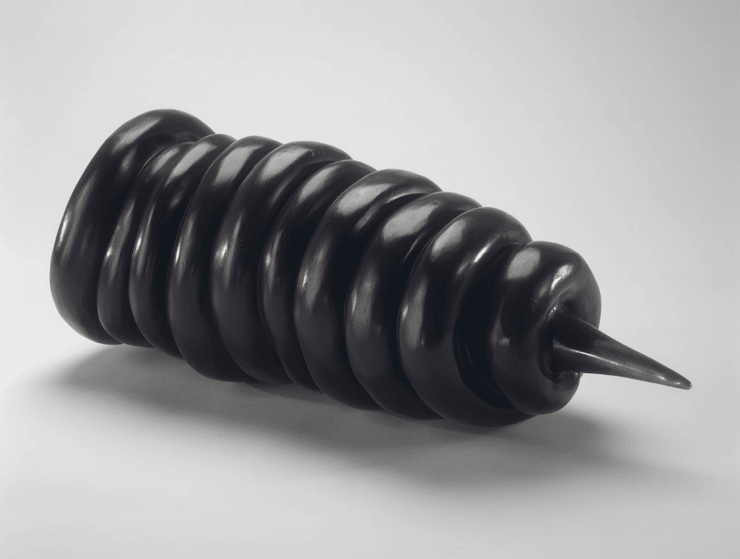
Bram Bogart, Round blue black square, 1966. Painted matter — 59 4/5 × 63 in | 152 × 160 cm. Courtesy Sofie Van de Velde.
Bram Bogart, Le Grand Blanc, 1962. Homemade paint (pigment, oil, glue, watercolour) on artist made board/canvas — 60 × 65 in | 152.5 × 165 cm. Courtesy Vigo Gallery.
Bram Bogart, Luna Mistenguet, 1960. Home made paint (pigment, oil, glue, watercolour) on artist made board / canvas — 77 1/5 × 51 1/5 in | 196 × 130 cm. Courtesy Vigo Gallery/
Bram Bogart, Fulmination, 1955. Oil on burlap — 22 4/5 × 42 1/2 in | 58 × 108 cm. Courtesy Ars Belga.
Bram Bogart, En cage, 1954. Acrylic, sand and plaster on panel — 61 1/5 × 28 3/10 in | 155.5 × 72 cm. Courtesy Ars Belga.
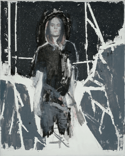
Case Study II: Mircea Suciu’s Monotype Technique
Another great example is Mircea Suciu‘s personal technique, combining acrylic paint, a type of monoprint he refers to as monotypes, and oil paint. His often edited photographic material is transferred onto the canvas with several monoprints, creating a vibrant grid-like effect, before reworking the image with paint, resulting in a recognizable technique and aesthetic. Suciu creates even more consistency by using a recognizable color palette, marked by blue and black-and-white, but also by tackling recurring concepts, such as pain, power, identity, existentialism, religion, and psychological issues rooted in the contemporary human condition.
Mircea Suciu, Santa Sangre, 2020. Oil, acrylic and monoprint on linen – 57 × 51 cm. Courtesy Zeno X Gallery, Antwerp.
Mircea Suciu, "Fall (1)", 2020. Oil, acrylic and monotype on linen – 176 × 123 cm. Courtesy Zeno X Gallery, Antwerp.
Mircea Suciu, Still Life with Lemon, 2019. Oil, acrylic, monoprint on linen – 13 4/5 × 13 4/5 in / 35 × 35 cm. Courtesy Zeno X Gallery.
Mircea Suciu, A Beauty Supreme (9), 2018. Oil, acrylic and monoprint on linen – 170 × 137 cm. Courtesy Zeno X Gallery, Antwerp.
Mircea Suciu, Wicked, 2018. Oil, acrylic and monoprint on linen – 75 3/5 × 43 3/10 in / 192 × 110 cm. Courtesy Zeno X Gallery.
Mircea Suciu, Head to Heart (2), 2018. Oil, acrylic and monoprint on linen – 116.8 × 96.5 cm. Courtesy Jason Haam, Seoul.
Mircea Suciu, The deceiver, 2015. Oil, acrylic and monoprint on linen – 51 × 62 cm. Courtesy Zeno X Gallery, Antwerp.
Mircea Suciu, "Camouflage (2)", 2015. Oil, acrylic and monoprint on linen – 114.8 × 81 cm. Courtesy Zeno X Gallery, Antwerp.
Mircea Suciu, Study for The iron curtain (3), 2014. Oil, monoprint, acryl, linen – 70 1/10 × 78 in / 178 × 198 cm. Courtesy of Zeno X Gallery.
Please note how they all experimented with the material attributes, revisiting the process and methodology of their medium before finding their trade. Find your own technical combination by experimenting with new surfaces—think Claire Tabouret, who paints on rugs, or Rémy Hysbergue, who paints on velvet—new mediums—think of Marco Reichert‘s machine-generated ink structures or Maya Makino‘s indigo dye for her panels—and new materials—think of Richard Serra’s recognizable steel patina or Fred Sandbacks use of colored cords. Numerous examples and numerous possibilities to explore.
So do not always go for the easy option, using the most predictable surface and the most convenient medium. There are already too many painters who paint with acrylic paint straight from the tube on a pre-stretched traditional canvas. Think out of the box, experiment, and elevate your art’s technical value and story, resulting in a unique contribution to art, a unique and recognizable technique, and a technical frame in which you can be free and continue to develop your oeuvre.
2. Visual Consistency
You do not always need to find a unique technique or reinvent a medium to achieve consistency from a visual point of view. Even more, you do not even have to confine yourself to a particular medium or discipline. There are various ways to achieve visual consistency across your artistic practice while using traditional or existing techniques. Once again, the best way to illustrate this is by discussing some clear examples of visual consistency by renowned artists.
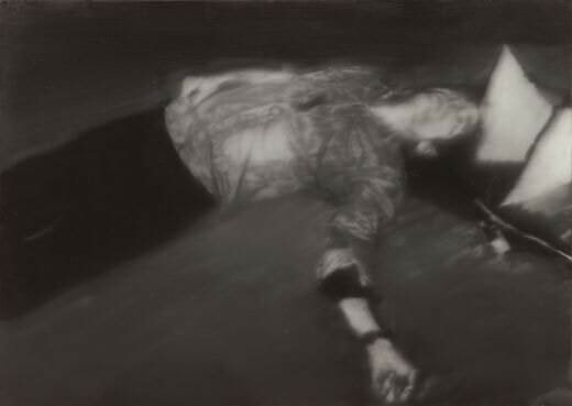
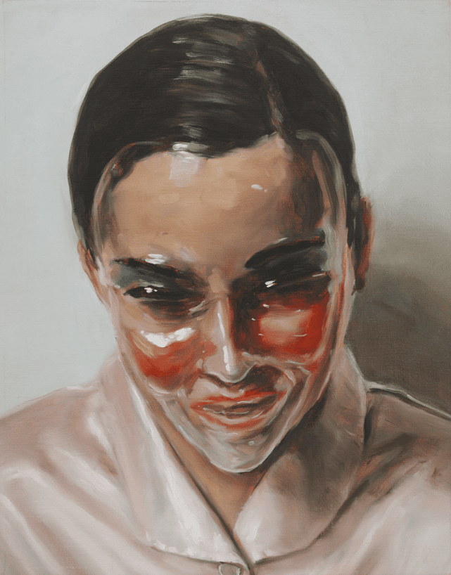
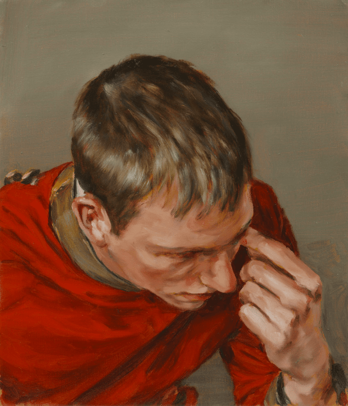
Case Study III: Luc Tuymans’ Palette & Brushwork
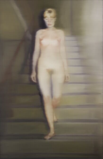
Luc Tuymans is a contemporary oil painter examining historical narratives, themes, and icons from a contemporary and painterly perspective. Even though working in a traditional medium such as oil painting, Tuymans’ oeuvre is marked by tremendous visual recognizability due to his characteristic muted color palette and rather nervous brushwork—a perfect example of the personal écriture of a painter.
By doing so, Tuymans is as free as it gets to explore his conceptual undercurrent (which also results in conceptual consistency; cf. infra), going from painting a political portrait examining Belgian colonial history, to a metaphorical still life contemplating the trauma of 9/11, to an abstract landscape which is actually dirt thrown on the floor illustrating the deceiving nature of painting, or a conceptual series of lifesize numbers contemplating the calculated representation of death and sickness with statistics during the Covid-19 Pandemic. Varied in genre and subject matter, but unified by his visual consistency and conceptual undercurrent.
Luc Tuymans, Dolls I, 2022. Oil on canvas — 102,5 x 66,5 cm. Courtesy Zeno X Gallery.
Luc Tuymans, Numbers (Three), 2020. Oil on canvas — 280,2 x 325 cm. Courtesy Zeno X Gallery.
Luc Tuymans, Twenty-Seventeen, 2017. Oil on canvas — 94,7 x 62,7 cm. Courtesy Zeno X Gallery.
Luc Tuymans, Presence, 2017. Oil on canvas — 248,7 x 182,6 cm. Courtesy Zeno X Gallery.
Luc Tuymans, Mountains, 2016. Oil on canvas — 283 x 187,5 cm. Courtesy Zeno X Gallery.
Luc Tuymans, Interior Nr. III, 2010. Oil on canvas — 235,1 x 233,4 cm. Courtesy Zeno X Gallery.
Luc Tuymans, The Secretary of State, 2005. Oil on canvas — 45,5 x 61,5 cm. Courtesy Zeno X Gallery.
Luc Tuymans, Still-life, 2002. Oil on canvas — 347 x 500 cm. Courtesy Zeno X Gallery.
Luc Tuymans, Mwana Kitoko, 2000. Oil on canvas — 208 x 90 cm. Stedelijk Museum voor Actuele Kunst.
Luc Tuymans, Lumumba, 2000. Oil on canvas — 62 x 46 cm. Courtesy Zeno X Gallery.
Luc Tuymans, De Wandeling (The Walk), 1993. Oil on canvas – 37 x 48 cm. Courtesy Zeno X Gallery, Antwerp.
Luc Tuymans, Der Diagnostische Blick IV, 1992. Oil on paper — 57 x 38 cm. Courtesy Zeno X Gallery.
Luc Tuymans, Gaskamer (Gas Chamber), 1986. Oil on canvas – 50 x 70 cm. Courtesy Zeno X Gallery, Antwerp.
Case Study IV: Yves Klein’s IKB (International Klein Blue)
Yves Klein’s multidisciplinary practice—working in painting, sculpture, drawing, performance, installation, and photography—is unified by the constant appearance of his iconic ultramarine, International Klein Blue (IKB). Klein was in search of communicating universal truths by making those invisible traces visible in art.
Think of his monochromatic painting liberating the spiritual notion of color, his pure pigment installations, but also anthropometry using the human body as a brush or revitalizing classical sculpture in contemporary art. Yves Klein’s bluer-than-blue hue enabled him to take on any artistic discipline while maintaining a strong sense of visual consistency.
Yves Klein, Monochrome bleu IKB, 1959. Pure pigments and synthetic resin on a gauze mounted on a panel — 13 × 12 in / 33 × 30.5 cm. Courtesy Galerie Natalie Seroussi.
Yves Klein, "Helena" (ANT 61) from the Anthropometries series, 2004. Lithograph in colors on paper — 30 × 22 × 1/10 in / 76.2 × 55.9 × 0.3 cm. Edition 66/150. Courtesy Bateau Lavoir.
Yves Klein, La Vénus d'Alexandrie, 1962-1982. IKB painted plaster cast — 27 3/5 × 11 4/5 × 7 9/10 in / 70 × 30 × 20 cm. Edition of 300 + 50AP. Courtesy Galerie Omagh.
Yves Klein, Éponge (SE251) (Sponge [SE 251]), 1961. Resin with pigment on sponge — 29 1/2 × 11 × 5 1/4 in | 74.9 × 27.9 × 13.3 cm. Collection SFMOMA.
Installation view of Yves Klein at MAMAC in Nice, France.
Installation view of Yves Klein at the Venet Foundation.
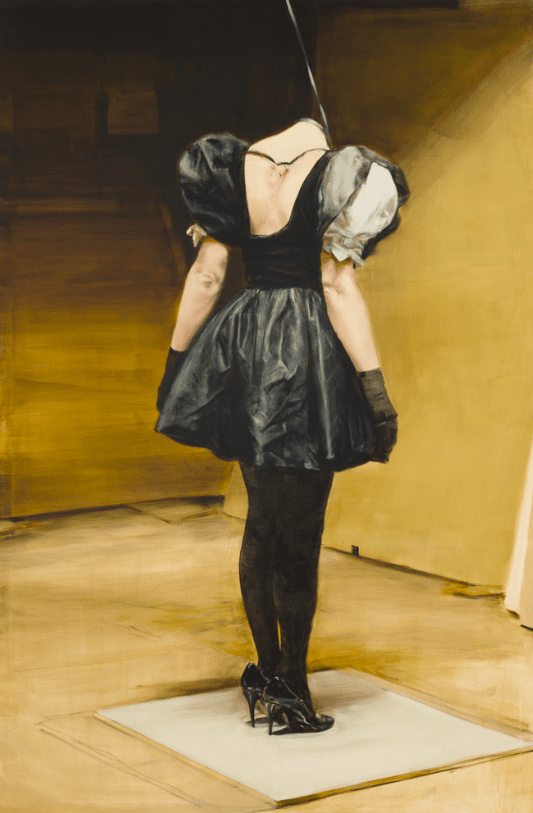
In addition, it is essential to identify what comes naturally to you when it comes to developing your own visual language. What is a recurring visual element you could amplify in your practice and make it an essential characteristic? For instance, the use of color—think of Ugo Rondinone’s use of fluorescent colors—the process of applying the paint or the artist’s écriture—Michaël Borremans‘ baroque-inspired painting process—or a distinct way of depicting your subjects—think of Fernando Botero’s chubby figures and even chubby still lifes or Georg Baselitz‘s upside-down figures. Identify your visual desires and attributes, focus on them, and develop that voice to be yourself more radically.
Further, please note how this visual consistency will also allow you to be freer regarding the subject matter. If you have identified your visual trade, you can connect the dots visually, moving between different genres and even disciplines.
3. Consistency in Presentation
An often overlooked strategy for consistency in the realms of the visual and the material is the presentation of the artwork or how it is finished. A common mistake numerous artists make—arguably preventing them from having an actual impact in the art world—is how they finish or present their piece. Let’s illustrate this with some examples.
Case Study V: Rinus Van de Velde’s White Borders & Titles
A great example is the use of white borders and a blank space preserved for the title or story of Rinus Van de Velde’s charcoal drawings depicting fictional narratives. His drawing-based practice is incredibly versatile, working in sculpture, installation, film, and drawing, yet everything is connected. His sculptures and installations are actually attributes and full-scale decors for his films and drawings, exploring fiction and reality.
Even more, due to the presentation of his drawings using artist frames and the natural frame of the surface with these white borders and the title at the bottom, the artist can draw any scene or narrative imaginable without losing visual consistency. This is proven once more as he recently allowed color to enter his drawings, first with colored pencil, then with oil pastels, allowing himself to develop further and keeping us at the edge of our seats in a recognizable visual frame.
Rinus Van de Velde, The walls are about to crack,..., 2020. Charcoal on canvas, artist frame — 203 x 149 cm. Courtesy Tim Van Laere Gallery.
Rinus Van de Velde, The map Robert had left them, (...), 2020. Charcoal on canvas, artist frame – 300 x 450 cm. Courtesy Tim Van Laere Gallery, Antwerp
Rinus Van de Velde, Two years, ten hours a day, (...), 2021. Charcoal on canvas, artist frame – 180 x 180 cm. Courtesy Tim Van Laere Gallery.
Rinus Van de Velde, He lived in a half-dream, which he carried around with him., 2021. Charcoal on canvas, artist frame — 150 x 150 cm. Courtesy Tim Van Laere Gallery.
Rinus Van de Velde, Being inside and outside myself..., 2020. Charcoal on canvas, artist frame — 185 x 180 cm.
Rinus Van de Velde, I am a frightened pleinairist ..., 2022. Oil pastel on paper — 112 x 159 cm. Courtesy Tim Van Laere Gallery.
Rinus Van de Velde, He constantly watches sport on television..., 2018. Colored pencil on paper, artist frame — 13,9 x 26,8 cm. Courtesy Tim Van Laere Gallery.
Case Study VI: Johnny Abrahams Floating Artist Frames
Johny Abrahams is one of the most exciting emerging abstract painters today, and once more, we encounter a tremendously consistent oeuvre with a substantial amount of versatility. Besides our previous two strategies (cf. supra) in terms of a personal and unique technique, the visual recognizability in terms of color and shapes, we also notice a consistent presentation of his pictures.
Abrahams’s floating artist frames have the same edges, depth, and natural wood color, increasing his paintings’ overall quality and consistency as collectible objects. Notice how the artist’s frame is often the visual continuum when he pivots his style and technique, softening the visual transition and maintaining visual unity when retrospectively looking back at his works.
Johnny Abrahams, Untitled (Yellow V), 2021. Acrylic and oil on burlap — 16 1/10 × 12 1/5 in | 41 × 31 cm. Courtesy JARILAGER Gallery.
Johnny Abrahams, Untitled (small ocher), 2019. Acrylic on canvas — 16 × 12 in | 40.6 × 30.5 cm. Courtesy Romer Young Gallery.
Johnny Abrahams, Blue & Red III, 2021. Oil on canvas — 17 7/10 × 11 3/5 in | 45 × 29.5 cm. Courtesy JARILAGER Gallery.
ohnny Abrahams, Untitled, 2021. Oil and wax on canvas — 84 × 48 in | 213.4 × 121.9 cm. Courtesy Vigo Gallery.
Johnny Abrahams, Black -Yellow Untitled, 2022. Acrylic and twine on canvas over panel — 18×12 inches. 45,7×30,5 cm. (walnut frame).
One often thinks it is about creating images, especially with painting, photography, collage, and drawing. And although the image or the picture is important, it is only 90% of the artwork, and as often, the last 10% makes the difference. Therefore you must think about your art as objects as well. How do you elevate your image to become a collectible object? Think of mounting your paper onto a panel, framing your painting on canvas, or printing your photography on a solid surface.
Even more, don’t think about this step as an inferior obligatory task because it is expected; approach it as an opportunity to distinguish yourself and increase the recognizability of your oeuvre. Take the time to think about this and experiment. The presentation or installment is not a sideshow but an integral part of the artwork. Do not go for a mass-produced floating or photo frame, but aim to distinguish yourself on this level as well. In doing so, by presenting or finishing your works consistently and originally, you can achieve the continuity and recognizability one is looking for.
4. Consistency of Motifs & Subjects
Instead of visible consistency in the technique, visual language, or presentation, an artist can also achieve consistency in the subject matter or the meaning of their works. First and foremost, having some recurring motifs, subjects, or genres determines the overall consistency of the artist’s oeuvre. In this case, the artist identified a specific set of motifs—or a specific subject or genre—and made it their own by revisiting it consistently throughout their entire career. And each time, they can revisit it in a different series, from a different perspective, aesthetic, or even artistic discipline. Let’s illustrate this strategy with two of the most influential female artists of the contemporary era; Yayoi Kusama and Louise Bourgeois.
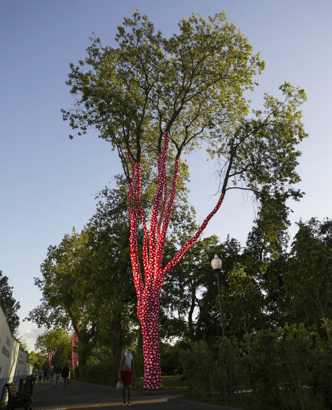
Case Study VII: Yayoi Kusama’s Pumpkins & Polka Dots
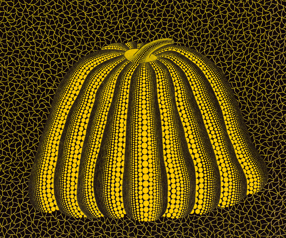
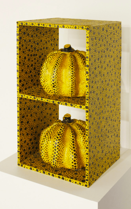
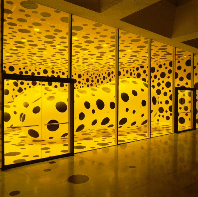
If one encounters an artwork marked by polka dots are a pumpkin—chances are the piece in question is by the hand of Yayoi Kusama. Her oeuvre is marked by her unique and colorful take on dazzling sensations of infinity, in which the polka dot is the main or sole motif. Kusama’s life, career, and work are dominated by autobiographical and especially mental experiences and issues. The Japanese artist suffers from hallucinations, experiencing infinity and seeing dots disappearing in that infinity resulting in distress.
Therefore, the polka dot motif came naturally to her artistic practice, obsessively painting them in her infinity nets, imposing them onto existing structures and objects, or populating her mirrored infinity rooms to replicate her sensations of infinity. We can often find the dots on her iconic pumpkin paintings, sculptures, and installations. The pumpkin symbolizes life due to its human-like quality and form. It is also a symbol of fertility, poetic peace, and her childhood—evoking sensations of laughter, joy, and enthusiasm to create pumpkins obsessively.
Yayoi Kusama, Pumpkin (M), 2014. Dimensions unknown. Courtesy of Victoria Miro gallery.
Yayoi Kusama, Reach Up to the Universe, Dotted Pumpkin, 2010. Variable dimensions.
Yayoi Kusama, All The Eternal Love I Have for the Pumpkins, 2016, acrylic pumpkins, LED lighting, black glass, mirrors, wood, metal, 292 x 415 x 415 cm.
Yayoi Kusama, Installation view of "Yayoi Kusama: Infinity Theory", 2015. Collection Garage Museum of Contemporary Art, Moscow.
Yayoi Kusama, Infinity Mirrored Room – The Souls of Millions of Light Years Away, 2013. Installation – Variable dimensions. Collection Garage Museum of Contemporary Art, Moscow.
Yayoi Kusama, Infinity Mirrored Room - The Souls of
Yayoi Kusama, Guidepost to the Eternal Space, 2015. Installation – Variable dimensions. Collection Garage Museum of Contemporary Art, Moscow.
Yayoi Kusama, Pumpkin, 1992. Acrylic on canvas – 60.7 × 72.9 cm. Courtesy Seoul Auction
Yayoi Kusama, Pumpkin, 1982. Mixed media – 53.5 × 26.8 × 25 cm. Courtesy MAKI.
Yayoi Kusama, Dots Obsession, 1997. Installation – Variable dimensions. Rice University Art Gallery.
Yayoi Kusama, Infinity Mirror Room Phalli's Field (Floor Show), 1965. Variable dimensions. Louisiana Museum of Modern Art, Humlebaek.
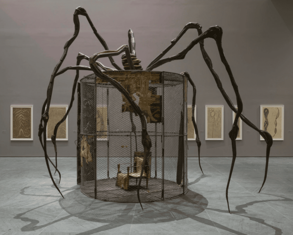
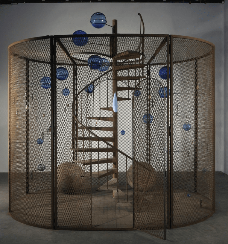
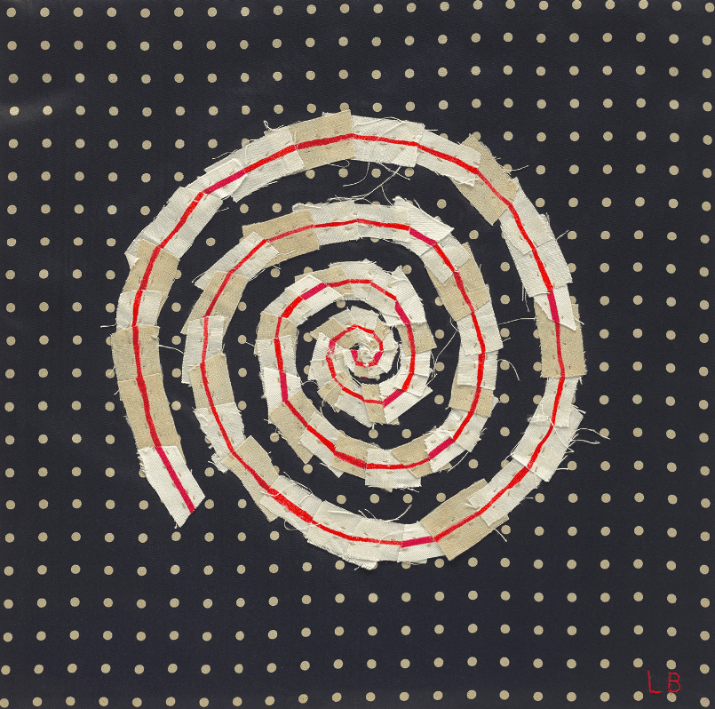
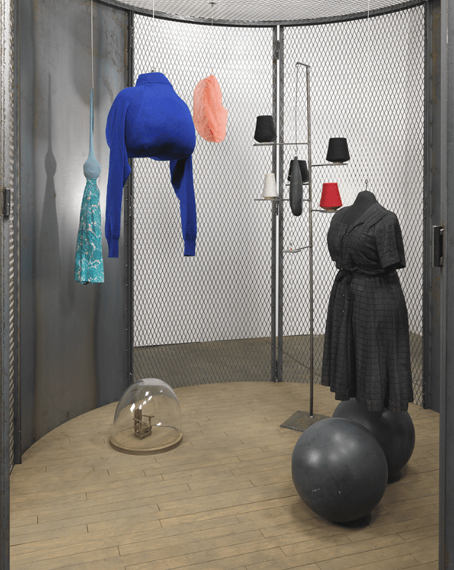
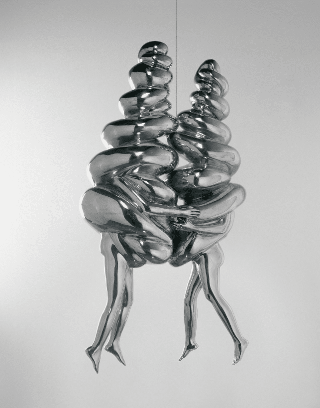
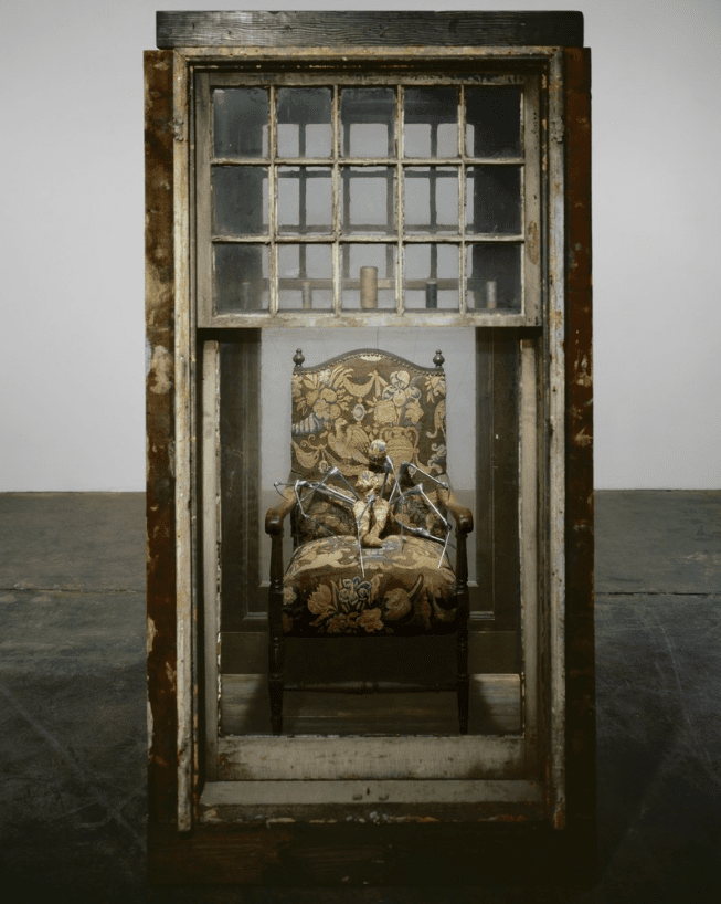
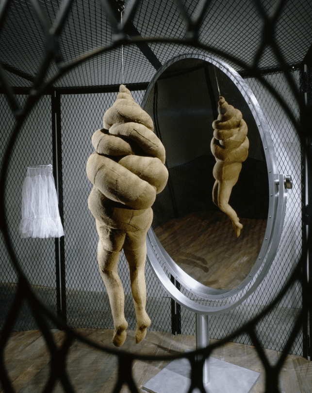
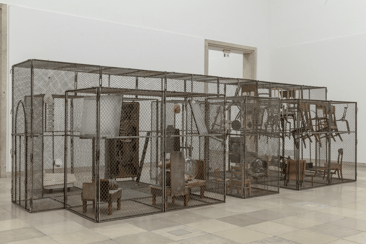
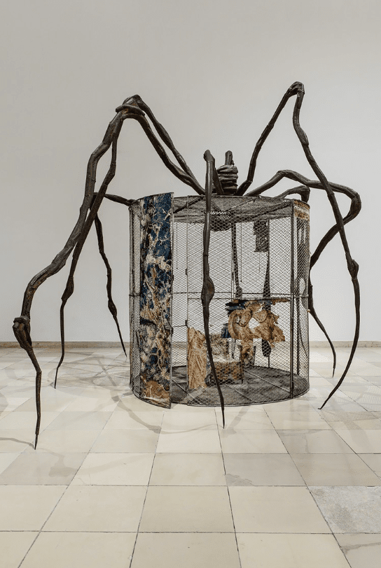
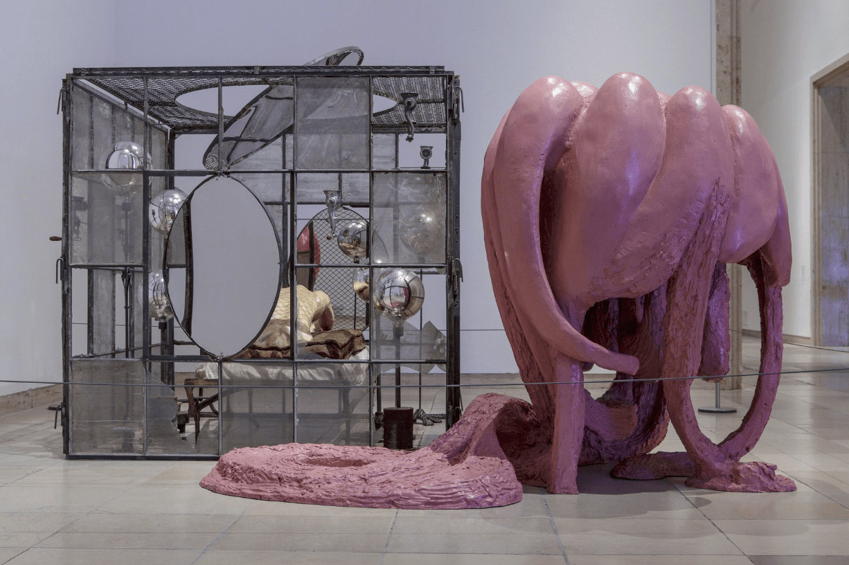
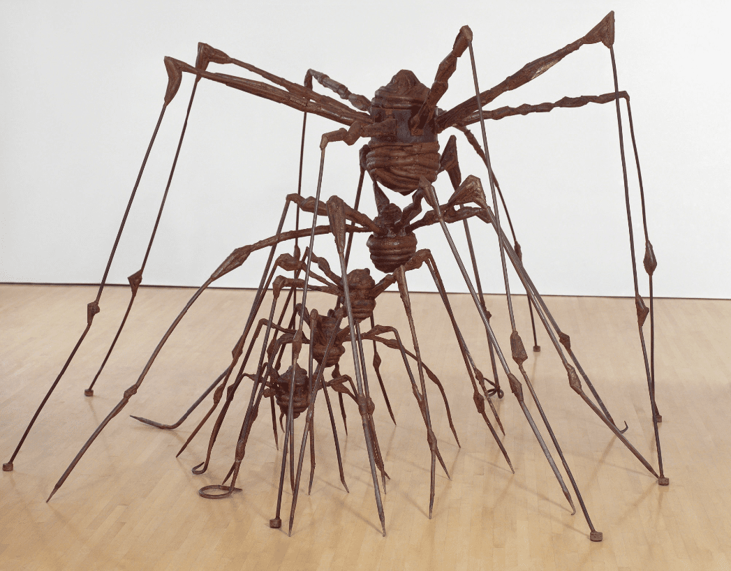
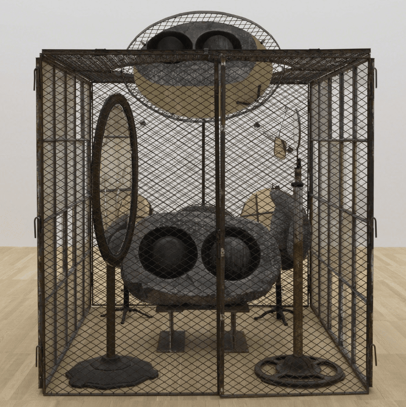
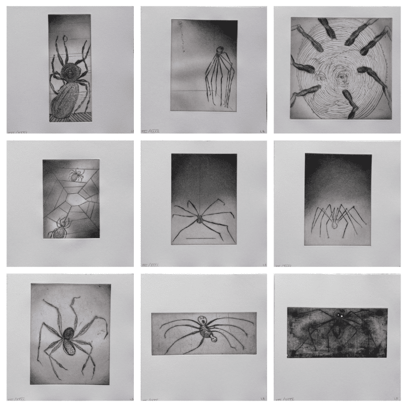
Case Study VIII: Louise Bourgeois’ Spiders, Spirals & Cells
Another great example can be found in the illustrious oeuvre of Louise Bourgeois—arguably one of the most important artists of the contemporary era. At the root of her artistic practice, we encounter an introspective take on her personal reality, revisiting early childhood trauma as a cathartic process. These autobiographical elements result in examining female sexuality, jealousy, violence, anxiety, feminism, and loneliness, which is visually translated to specific motifs to give form to these experiences with her iconic spiders, cages (cells), spirals, but also houses, body parts, and drawings. These motifs of personal symbolism result in psychological release, using the power of association, memory, fantasy, and fear.
By doing so, Bourgeois’s spiders embody her mother and herself for their cleverness, industriousness, protectiveness, and being misunderstood. Bourgeois discusses how spiders don’t get mad when you destroy their family’s web, but they start weaving—another important aspect in her artistic practice—to restore her web and protect her family. An allusion to her mother’s strength in times of infidelity and betrayal during Bourgeois’ youth, hence titling her spiders most often as Maman.
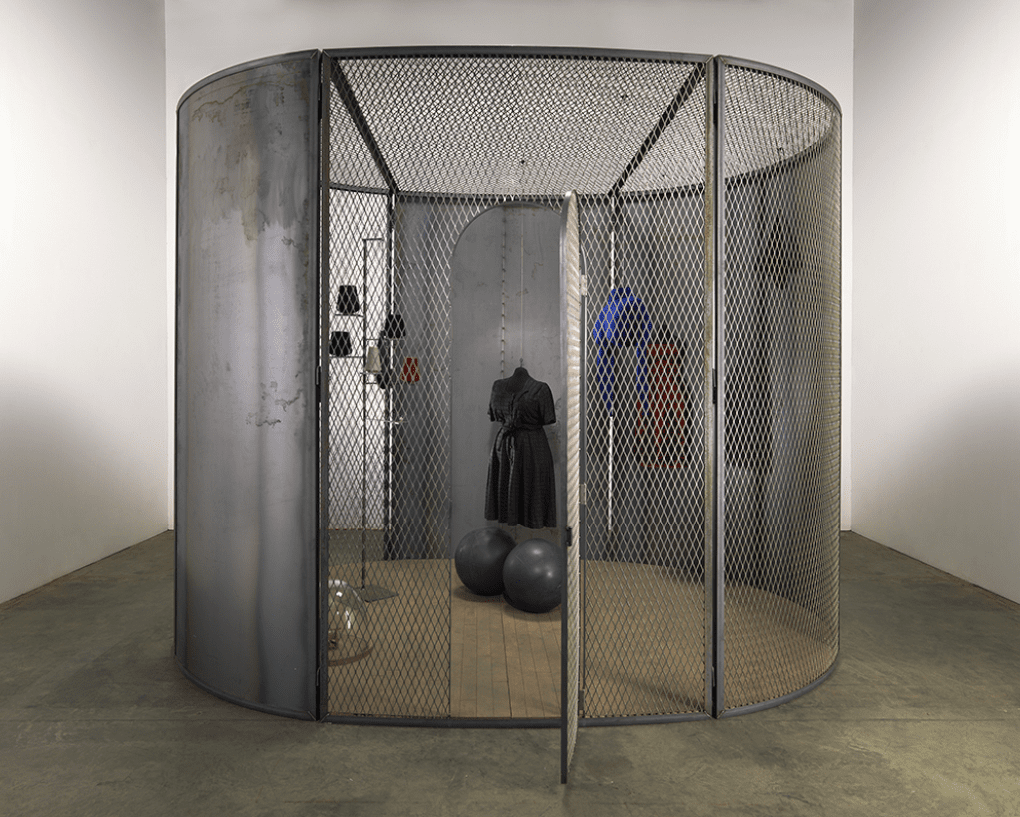
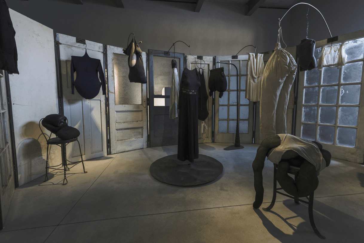
The cages or cells are psychological microcosms in which she collects and displays various objects symbolic of her youth to evoke an emotional resonance in a defined space as if entering an interior world in the exterior world of the exhibition space; but also, the metaphor of the inner world filled with memories as a cell or cage; challenging to access, and simultaneously to get out.
To conclude, Bourgeois’s spirals symbolize an ongoing natural cycle, from birth to life, death, and rebirth. As a result, it is associated with her experiences of motherhood, but even more, with personal memories from twisting and turning the tapestries in the river when she was a child, wringing them, to dreaming of wringing the neck of her father’s mistress into a spiral. As a result, the spiral symbolizes a natural cycle but also control, freedom, revenge, and more.
Installation view of 'Louise Bourgeois: An Unfolding Portrait' at The Museum of Modern Art, New York (MoMA in New York, 2017.
Haus der Kunst, Munich, Germany “Louise Bourgeois, Structures of Existence: The Cells” (2/27/15-8/2/15)
Louise Bourgeois, Cell (The last climb), 2008. Steel, glass, rubber, thread and wood – 384.8 × 400.1 × 299.7 cm. Courtesy Guggenheim Museum, Bilbao.
Louise Bourgeois, Untitled, 2006. Ink on fabric and fabric collage – 39.4 × 39.7 cm. Courtesy Phillips.
Louise Bourgeois, Cell (Black Days), 2006. Steel, fabric, marble, glass, rubber, thread and wood – 304.8 × 397.5 × 299.7 cm. Courtesy Song Art Museum, Beijing.
Louise Bourgeois, The Couple, 2003. Dimensions unknown. Courtesy Moderna Museet, Stockholm.
Louise Bourgeois, Lady in waiting, 2003. Tapestry, thread, stainless steel, steel, wood and glass – 208.3 × 110.5 × 147.3 cm. Courtesy Guggenheim Museum, Bilbao.
Louise Bourgeois, Cell XXVI (detail), 2003. Steel, fabric, aluminum, stainless and wood – 252.7 × 434.3 × 304.8 cm. Courtesy Guggenheim Museum, Bilbao.
Louise Bourgeois, Couples, 2001. Color lithograph on Arches paper – 111.8 × 66 cm. Edition of 100. Courtesy Carolina Nitsch Contemporary Art.
Louise Bourgeois, Spider, 1997. Steel, tapestry, wood, glass, fabric, rubber, silver, gold and bone – 449.6 × 665.5 × 518.2 cm. Courtesy Song Art Museum, Beijing.
Louise Bourgeois, Passage Dangereux, 1997. Metal, wood, tapestry, rubber, marble, steel, glass, bronze, bones, flax and mirrors – 264.2 × 355.6 × 876.3 cm. Courtesy Guggenheim Museum Bilbao.
Louise Bourgeois, Spider, 1997. Steel, tapestry, wood, glass, fabric, rubber, silver, gold, and bone – 449.6 × 665.5 × 518.2 cm. Courtesy Museum of Modern Art, New York.
Louise Bourgeois, Cell (Clothes), 1996. Dimensions unknown. Courtesy Fondazione Prada.
Louise Bourgeois, In and Out, 1995. Metal, glass, plaster, fabric, and plastic. Courtesy Garage Museum of Contemporary Art, Moscow.
Louise Bourgeois, The Nest, 1994. Steel – 256.5 × 480.1 × 401.3 cm. Collection San Francisco Museum of Modern Art (SFMoMA)
Louise Bourgeois, Cell (Eyes & Mirrors) 1989-93., 1989-1993
Louise Bourgeois, Ode A Ma Mere - portfolio (9), s.d.. Drypoint – 30 × 30 cm. Courtesy Composition Gallery.
Louise Bourgeois, Nature Study #1, 1985. Bronze, dark and polished patina – 17.8 × 48.3 × 17.8 cm. Courtesy Cheim & Read.
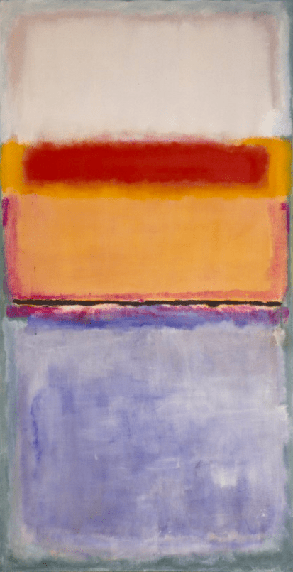
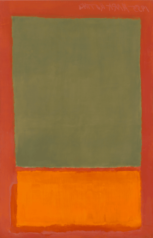
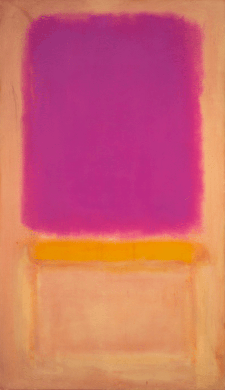
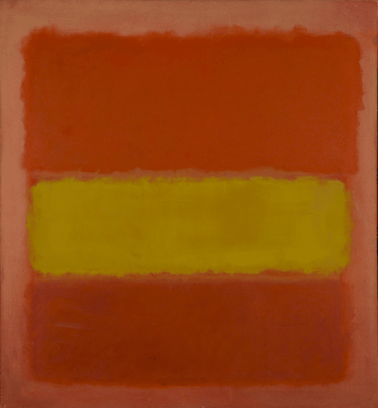
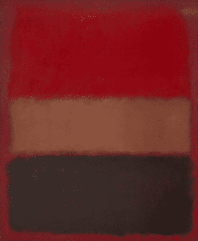
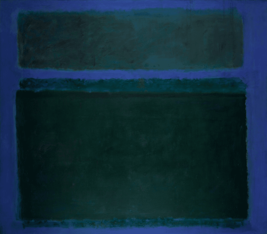
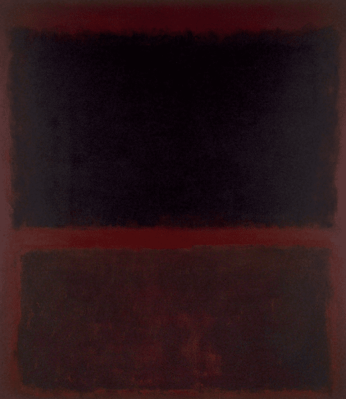
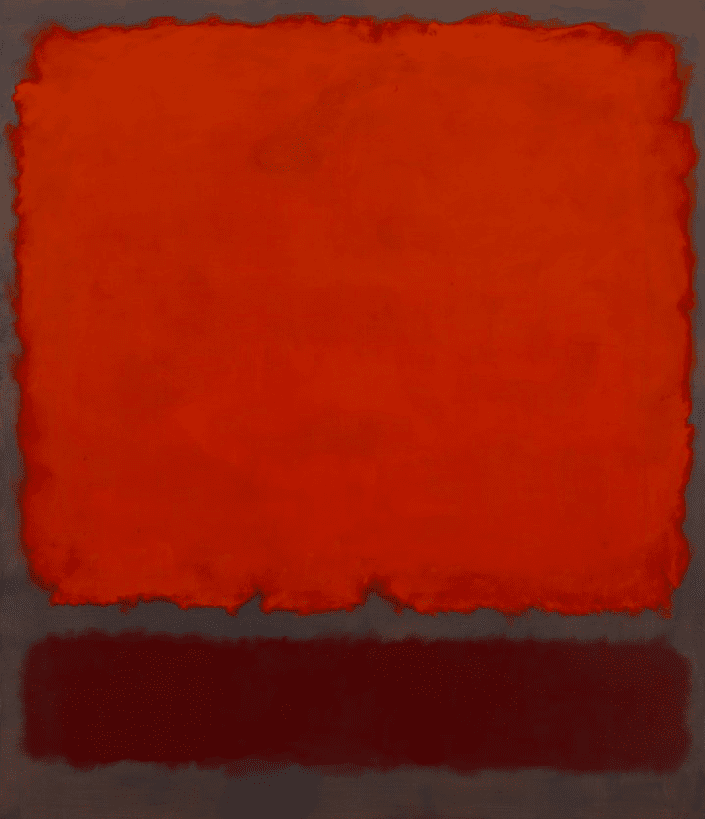
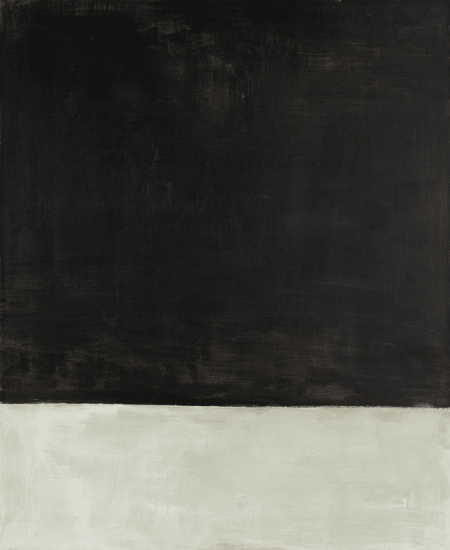
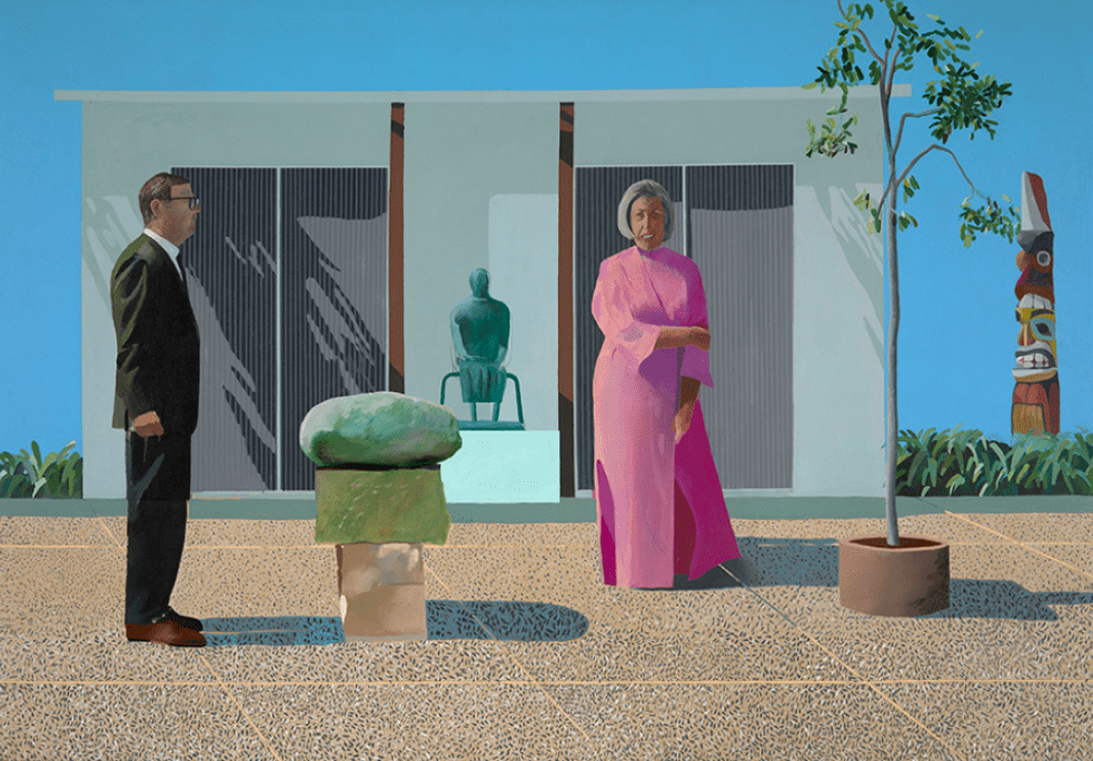
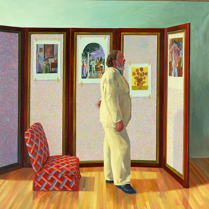
These motifs become true emblems for those artists, just as the Campbell’s Soup Cans is an emblem for Andy Warhol or the melted clocks are with Salvador Dali—we instantly associated them with the artist because they made it their own. These emblems and motifs can be found or attained in various ways when giving it the proper focus and personal interpretation. Think of abstract shapes like the square with Josef Albers and the rectangle with Mark Rothko. Or what about genres such as the portrait with David Hockney or the landscape with Emma Webster?
Revisit the motifs, subjects, or genres you feel a natural affinity for—an urge to create, recreate, and explore all its possibilities by making them your own. Follow these urges in the most radical manner.
5. Conceptual & Methodological Consistency
These recurring motifs and genres are often intrinsically linked to conceptual or methodological consistency. Having a clear and distinctive vision and conceptual foundation is a terrific strategy to achieve a consistent body of work while remaining visually free, enabling the artist to take various aesthetics, artistic disciplines, or subjects. In this case, at the core of the artistic practice, there must be a clear idea, starting point, or methodology that initiates every artwork you produce. A less obvious but very powerful approach and strategy to develop a compelling and versatile oeuvre while remaining consistent.
Case Study IX: Tracey Emin’s Autobiographical Multidisciplinary Practice
In a similar vein as the aforementioned Louise Bourgeois and Yayoi Kusama, we start with an artist whose oeuvre is marked by autobiographical elements, none other than Tracey Emin. The British artist deals with personal experiences and trauma in an unseen genuine manner—exposing her life, flaws, and struggles with no filter, opting to show us the utmost frank, intimate, raw, and honest version of her. By doing so, the artist shifts from ready-made sculpture to installation to figurative painting—however, remaining consistent due to her recurring autobiographical starting point and the aura of honesty and rawness resonating from every single piece.
Think of discussing her sexual partners in her infamous Everyone I Have Ever Slept With 1963-1995—also known as The Tent—writing all the names of the people down in a tent of the people she slept with. With My Bed from 1998, Emin presented a sexual and depressive phase of her life by showcasing the unmade and stained bed in which she slept, ate, had sex, and drank alcohol for four days straight. Or what about her neon sculptures, sharing her private thoughts and deepest desires in light? To conclude, in Emin’s paintings, we encounter the same conceptual foundation, depicting scenes of self-exploration, pain, and passion, in an expressive and visceral manner.
Tracey Emin, Everyone I Have Ever Slept With 1963–1995, 1995. Variable dimensions. Collection Saatchi.
Tracey Emin, My Bed, 1998. Variable dimensions.
Tracey Emin, People Like You Need To Fuck People Like Me, 2007. Neon – 114.3 × 182.9 × 6.4 cm. Edition of 3 + 2AP. Courtesy Gallery Red.
Tracey Emin, I Longed For You, 2019. Neon — 121 1/2 x 185 1/16 in. (308.6 x 470 cm). Courtesy White Cube.
Tracey Emin, A Message, From the Gods in Advance – December 2019, 2019. Acrylic on canvas — 8 1/16 × 8 in. (20.5 × 20.3 cm)8 7/16 × 8 1/2 × 1 1/4 in. (21.5 × 21.6 × 3.1 cm) (framed). Courtesy White Cube.
Tracey Emin, Being Without You, 2014. Bronze — 3 3/4 × 13 3/8 × 2 15/16 in. (9.5 × 34 × 7.5 cm). Courtesy White Cube.
Tracey Emin, Devoured by you, 2014. Gouache on canvas — 79 15/16 × 110 1/4 in. (203 × 280 cm). Courtesy White Cube.
Tracey Emin, A Place to Love, 2015. Embroidered calico — 63 3/4 × 76 3/4 in. (162 × 195 cm)71 7/8 × 85 1/16 × 3 3/8 in. (182.5 × 216 × 8.5 cm) (framed). Courtesy White Cube.
Tracey Emin, And So It Felt Like This, 2018. Acrylic on canvas — 72 1/16 x 48 1/16 in. (183 x 122 cm). Courtesy White Cube.
Tracey Emin, The Mother, 2020. Bronze — 7 1/16 × 4 13/16 × 6 5/16 in. (18 × 12.2 × 16 cm). Courtesy White Cube.
Tracey Emin, Wet, 2021. Acrylic on canvas — 152 x 182 cm. Courtesy White Cube.
Tracey Emin, I’m not a Fucking Animal, 2023. Acrylic on canvas — 48 1/5 × 48 1/10 × 1 1/2 in / 122.4 × 122.3 × 3.8 cm. Courtesy Xavier Hufkens.
Case Study X: Christian Boltanski’s Installations as Memorial Monuments
In the works of Christian Boltanski, we encounter the recurring concepts of loss, memory, death, oblivion, and the artist’s childhood—as he was born during the Second World War while the Nazi regime occupied Paris. By doing so, Boltanski fuses the every day with high art to create installations that function as memorials. This conceptual undercurrent transforms sculptures into shrines or relics and installations into monuments to contemplate lost lives and to reflect oblivion connected with loss—the halt of memory.
Think of his monumental site-specific installation at the Grand Palais in Paris, France, titled Personnes, with monumental piles of clothes suggesting lost lives, mass murders, massacres, the holocaust, and the ongoing refugee crisis. Or what about his light installations, creating almost religious altars for unknown people—implementing the decorum and iconography of Christianity as a non-religious person, presumably hinting at the problem of theodicy, but also salvation, and the afterlife, living on in memory.
Christian Boltanski at Grand Palais in Paris, France.
Schermafbeelding 2022-03-09 om 17.30.22
Christian Boltanski, Untitled from the Monument Odessa, 1989. Gelatin silver prints, metal biscuit tins, electric lightbulbs, sockets and electric wires — 104 × 118 × 8 3/5 in | 264.2 × 299.7 × 21.9 cm. Courtesy Philips.
Christian Boltanski, 27 Possibilites d'Autoportrait, 2007. 27 black and white photos — 12 3/8 x 10 x 3/4 in. (31.5 x 25.5 x 2 cm). Edition of 3. Courtesy Marian Goodman Gallery.
Christian Boltanski, Scratch, 2014. 19 frames, 3 sockets, 3 lightbulbs, black cables — 17 3/4 x 58 1/4 in. (45 x 148 cm). Courtesy Marian Goodman Gallery.
Christian Boltanski, Crépuscule (Twilight), 2015. Light bulbs, lamp sockets and black electric cables — Dimensions variable. Edition of 3 plus 1 artist's proof. Courtesy Marian Goodman Gallery.
Christian Boltanski, Animitas (Chili), 2014. Video projection (13 hrs., 6 sec.), flowers, hay, one bench — Dimensions variable. Edition of 3 plus 3 artist's proofs. Courtesy Marian Goodman Gallery.
Christian Boltanski, Misterios, 2017. 3 screen projection, sound, color; 12 hrs — Dimensions variable. Edition of 3 plus 3 artist's proofs. Courtesy Marian Goodman Gallery.
It is safe to say the consistency in their oeuvre is less convenient to notice—as it requires an effort from the viewer to discover the subject matter first—yet, this makes the interaction with the artwork and your affinity with the artist’s consistency more profound and intense. One could describe this strategy as having a clear artist statement, following that vision closely, and implementing it creatively. Think of Ann Veronica Janssens’s urge to capture the elusive and ephemeral or Alicja Kwade‘s investigation of the role of structures in our society and reality about technology and philosophy.
With this conceptual and methodological strategy, artists often develop their work with series-based or research-based groups of work, exploring a specific subject or motif (cf. infra) from their conceptual foundation. Think of the performance- or experience-based practices of artists such as Sophie Calle and Francis Alÿs or research-based practices by artists such as Otobong Nkanga or Lynn Hershman Leeson. So what is your desired starting point, methodology, or vision? And in which ways can you implement and explore it creatively?
6. Intentional Inconsistency
Last but not least, we have oeuvres by artists that defy any categorization with intentional inconsistency. Although this might sound counterintuitive initially, several artists successfully create a compelling oeuvre with significant shifts throughout the years while making sense. This deliberate inconsistency is often supported by a specific conceptual foundation or methodological approach (cf. infra). Yet, their intentional and radical shifts—often within the same artistic discipline—become a characteristic element or aspect of their practice, keeping us on the edge of our seats, curious about what comes next. Please note that intentional inconsistency can be very tricky and is a rather slippery slope and is best suited for neo-conceptual multidisciplinary artists, such as our first artist, Maurizio Cattelan.
Case Study XI: Maurizio Cattelan’s No-Style-Style
An excellent example is Maurizio Cattelan’s playful, witty, humorous, and satirical Neo-conceptual oeuvre. Cattelan is one the best-known artists working in a so-called No-Style-Style. Every piece intends to evoke a reaction, from laughter to controversy, commentary to engagement. However, formally and conceptually, there are no limitations. If the idea is good, the artwork will be good—regardless of how it fits into his oeuvre. Nevertheless, specific motifs and materials have been characteristic of Cattelan’s oeuvre throughout the years. Think of the taxidermies or the wax mannequin figures.
Maurizio Cattelan, The Ballad of Trotsky, 1996. Taxidermized horse, leather saddlery, rope – 270 x 200 x 75 cm. Courtesy Fondation Louis Vuitton. Photo: Marc Domage.
Maurizio Cattelan, Ego, 2019. Taxidermized crocodile — 346 x 60 x 36 cm | 136 1/4 x 23 5/8 x 14 3/16 inch. Edition of 3. Courtesy Perrotin.
Maurizio Cattelan, America, 2016-2017. Variable dimensions. Installation view at the Solomon R. Guggenheim Museum, NEW YORK (USA), 2016. Courtesy Perrotin.
Maurizio Cattelan, UNTITLED (ZORRO), 1999. Acrylic on canvas — 110 x 110 cm | 43 1/4 x 43 1/4 inch. Courtesy Perrotin.
Maurizio Cattelan, L.O.V.E, 2010. White Carrara Marble, roman travertine
Maurizio Cattelan, THE NINTH HOUR, 2003. Ceramic — 6 3/4 x 24 3/4 x 8 5/8" : 17 x 63 x 22 cm | 6 3/4 x 24 3/4 x 8 5/8 inch
Maurizio Cattelan, Untitled, 2002. Taxidermized donkey, cart — 250 x 400 x 165 cm | 8.2 ft x 13.1 ft x 65 inch. Courtesy Perrotin.
Maurizio Cattelan, All, 2007. Nine sculptures of Carrara marble. Courtesy Perrotin.
Maurizio Cattelan, Charlie don't surf, 1997. Collection Fondation Louis Vuitton.
Maurizio Cattelan, Untitled, 2009. Taxidermy — 62 2/5 × 74 4/5 × 78 7/10 in | 158.5 × 190 × 200 cm. Collection Sifang Art Museum.
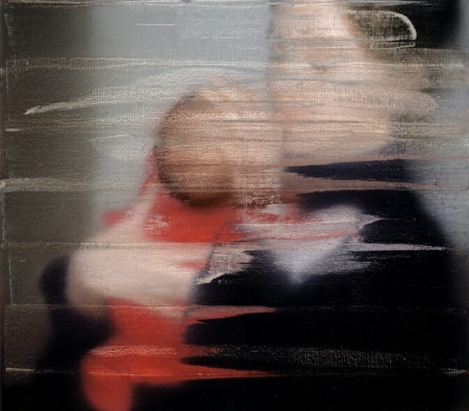
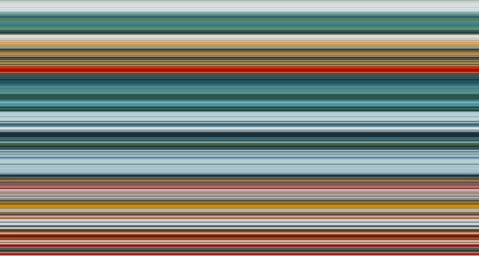
Case Study XII: Gerhard Richter’s Ongoing Quest in Painting
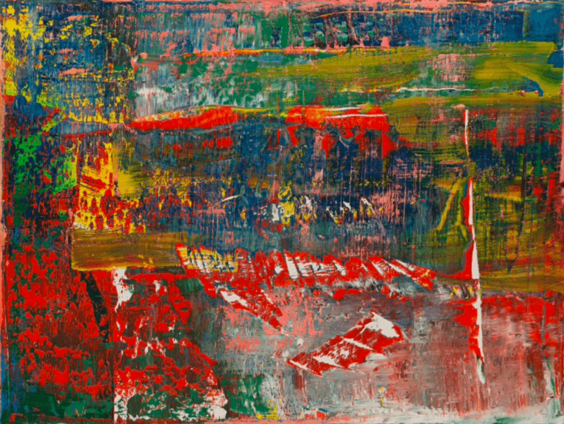
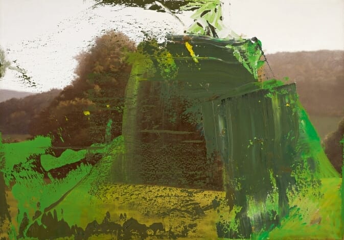
Another extreme example of intentionally denying to fit in a box is Gerhard Richter‘s ongoing quest to explore painting’s possibilities and limitations—often in relation to photography. Richter grew up in Eastern Germany, where they were forced to create art in the academic tradition of Social Realism. And this confinement, followed by experiencing liberation in creativity, had set the tone for various radical shifts and painterly ventures. Throughout his life, Richter continued to take on different subjects and ways of painting—because he could and because of his unending curiosity and dissatisfaction.
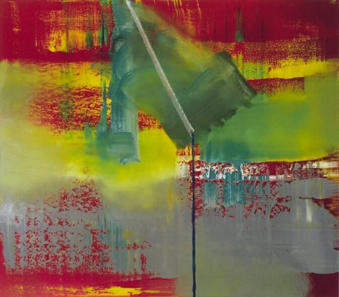
By doing so, Richter has painted almost all genres with his photo paintings, followed by more minimal figurative paintings of curtains, corrugated tubes, a sheet of metal, doors, windows, and turning sheets of paper, to entering abstraction in his photorealistic paintings via his Richter haze. Here, the abstraction again varies from expressive to monochrome, pasty to flat, and colorful to black and white. Think of his large abstracts, color charts, and strips.
Gerhard Richter, Tante Marianne (Aunt Marianne), 1965. Oil on canvas – 100 x 115 cm. Courtesy the artist.
Gerhard Richter, Ema (Nude on a Staircase), 1966. Oil on canvas – 200 x 130 cm. Courtesy the artist.
Gerhard Richter, Abstraktes Bild, 2015. Oil on canvas – 92 x 122 cm. Courtesy the artist.
Gerhard Richter, Betty, 1988. Oil on Canvas – 102 × 72 cm. Courtesy Fondation Beyeler, Riehen.
Gerhard Richter, Baumgruppe (Clump of Trees), 1987. Oil on canvas – 72 cm x 102 cm. Courtesy Gerhard Richter (c)
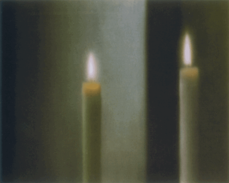
Gerhard Richter, Two Candles, 1982. Oil on canvas – 80 x 100 cm. Courtesy the artist.
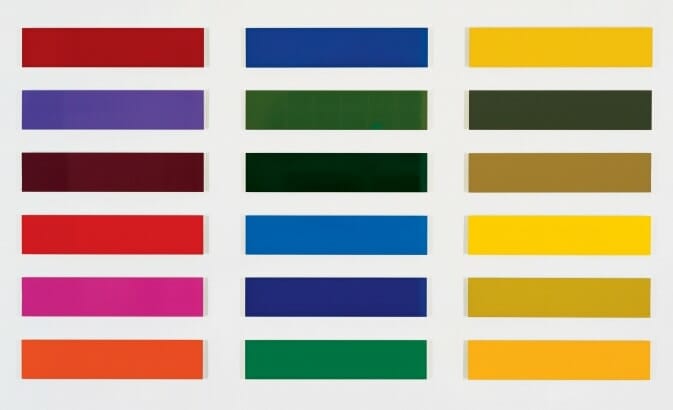
Gerhard Richter, Eighteen Colour Charts, 1966. Lacquer on Alucobond – 250 x 450 cm. Courtesy the artist.
Gerhard Richter, Vermalung (braun)/Inpainting (brown), 1972. Oil on canvas – 27 x 40 cm. Courtesy the artist.
Gerhard Richter, Abstraktes Bild/Abstract Painting, 1979. Oil on canvas – 95 x 115 cm. Courtesy the artist.
Gerhard Richter, Erschossener 1 (Man Shot Down 1), 1988. Oil on canvas – 100 x 140 cm. Courtesy the artist.
Gerhard Richter, S. mit Kind (S. with Child), 1995. Oil on canvas — 36 x 41 cm. Collection Hamburger Kunsthalle, Hamburg, Germany.
Gerhard Richter, Strip, 2011. Digital print on paper between aluminium and Perspex (Diasec) – 160 x 300 cm.
Gerhard Richter, 31.1.89, 1989. Oil on colour photograph — 148 x 100 mm
Gerhard Richter, Grey, 1970. Oil on canvas — 40 cm x 50 cm
Gerhard Richter, 192 Colours, 1966. Oil on canvas — 200 cm x 150 cm
Gerhard Richter, Turned Sheet, 1965. Oil on canvas — 26 cm x 20.3 cm
Gerhard Richter, Tubes, 1967. Oil on canvas — 60 cm x 60 cm
Gerhard Richter, Townscape Madrid, 1968. Oil on canvas — 277 cm x 292 cm
Gerhard Richter, Sheet Metal, 1988. Oil on canvas — 20 cm x 26.8 cm
Gerhard Richter, Window, 1968. Oil on canvas — 200 cm x 400 cm
Gerhard Richter, Seascape (Cloudy), 1969. Oil on canvas — 200 x 200 cm
Gerhard Richter, Annunciation after Titian, 1973. Oil on canvas — 125 cm x 200 cm
Gerhard Richter, 5 Doors (II), 1967. Oil on canvas — 235 cm x 110 cm
Gerhard Richter, Detail (Makart), 1971. Oil on canvas — 200 cm x 200 cm
Gerhard Richter, September, 2005. Oil on canvas — 52 cm x 72 cm
Gerhard Richter, Curtain III (Light), 1965. Oil on canvas — 200 cm x 195 cm
Gerhard Richter, Corrugated Iron, 1967. Oil on canvas — 115 cm x 80 cm
Gerhard Richter, Clouds, 1970. Oil on canvas — 200 cm x 300 cm
Gerhard Richter, Man Shot Down 1, 1988. Oil on canvas — 100 cm x 140 cm
Gerhard Richter, Moonscape II, 1968. Oil on canvas — 200 cm x 260 cm
Gerhard Richter, Apples, 1984. Oil on canvas — 65 cm x 80 cm
Final Thoughts: The Oeuvre is Never Finished
Continue to develop, experiment, and follow your artistic intuition as the impelling force of your development. Allow yourself to pivot when you feel the desire to. But when pivoting, or reinventing a part of your work, do it convincingly. Don’t do it for a couple of paintings, but for at least a couple of years. Aim to combine several of these six strategies to ensure continuity. And in times of radical changes, try to maintain at least one of the strategies.
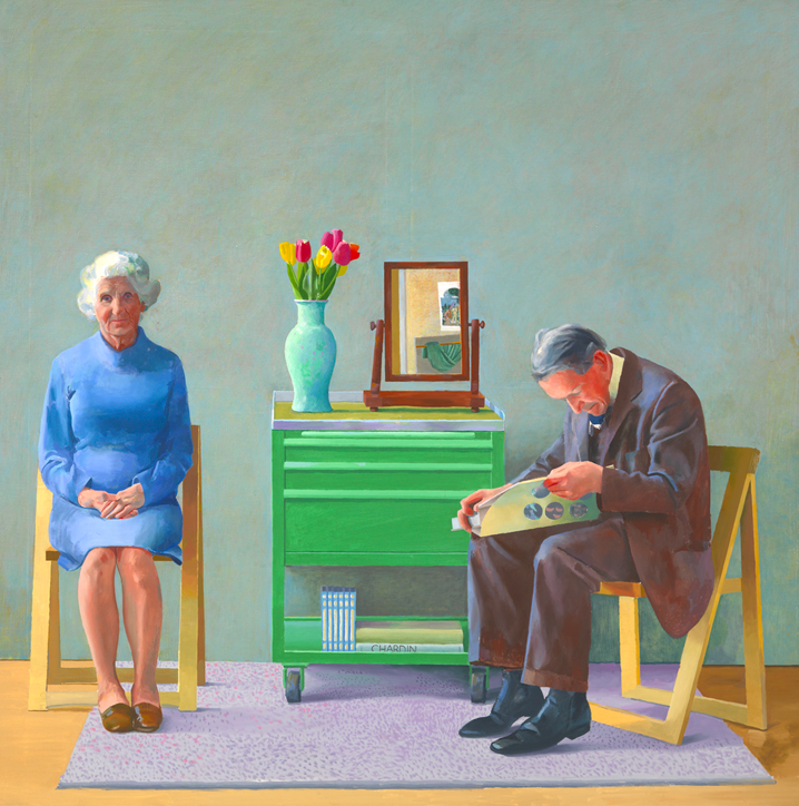
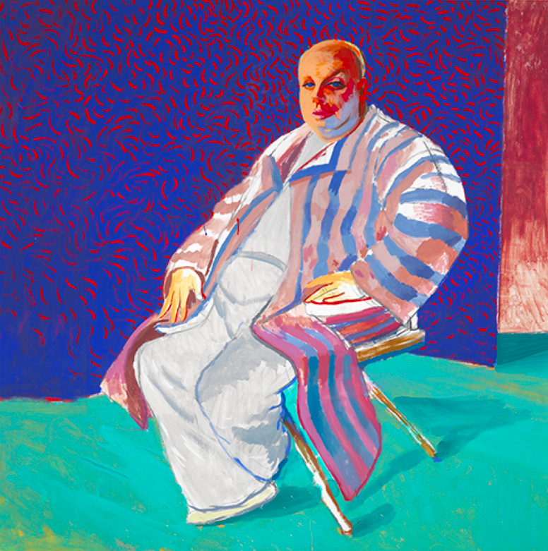
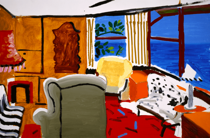
The ongoing development is key. Art evolves, and so should you. Louise Bourgeois was more than eighty years old when she introduced the spider to the world in her already impressive oeuvre—and it will be one of the main motifs that she’ll be remembered for. David Hockney shifted his rather naturalists works from the 60s and 70s—that were tremendously popular—to more abstracted paintings using inverted perspective, revitalizing his relevance whereas the art movement of photorealism encountered a silent death. As the cliché states; it is about the journey, not the destination.
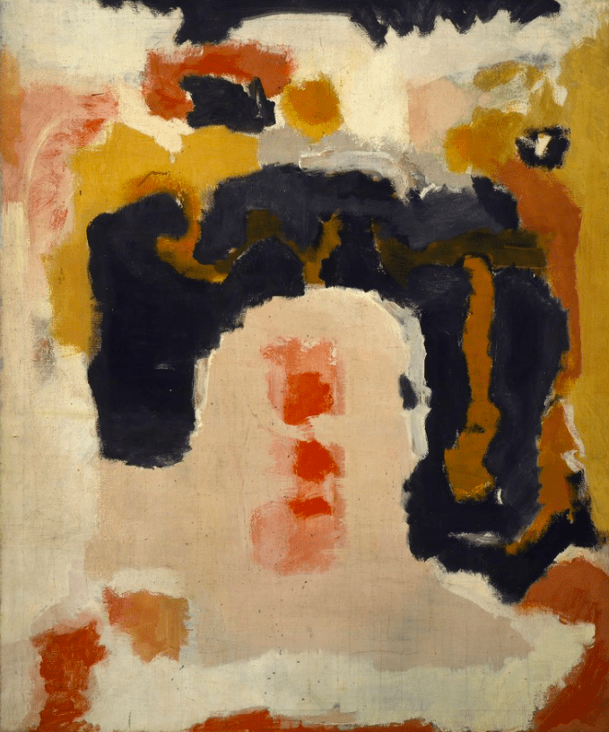
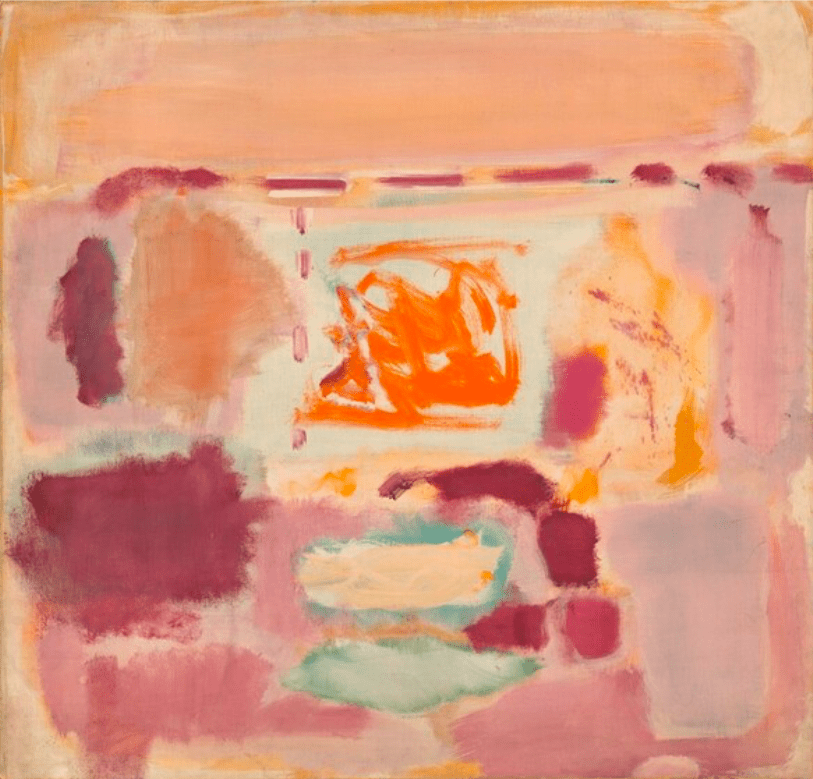
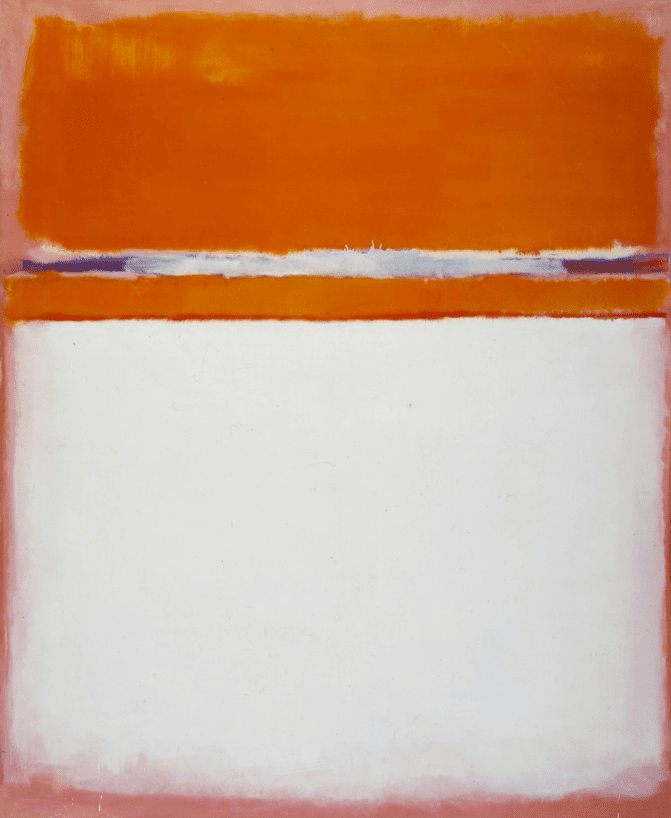
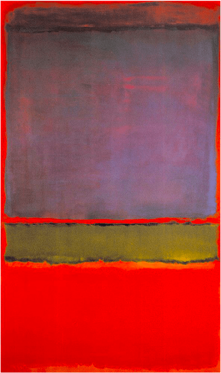
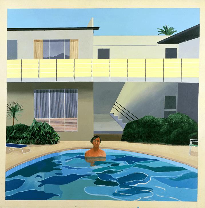
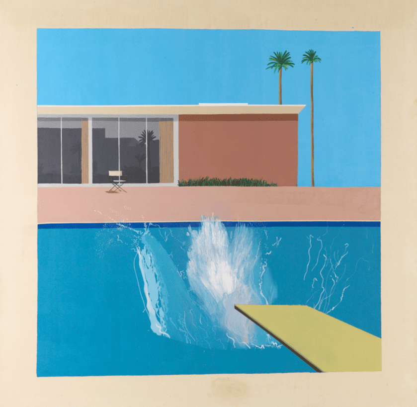
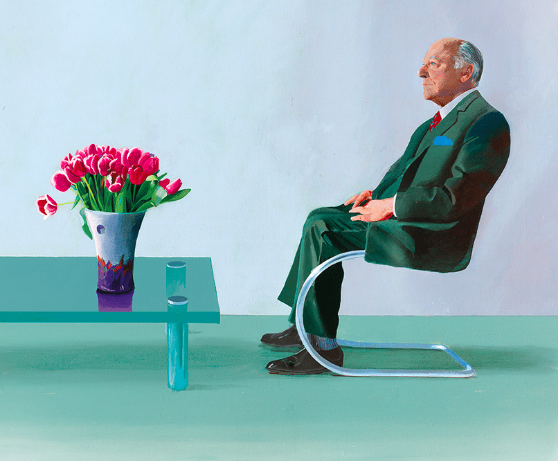
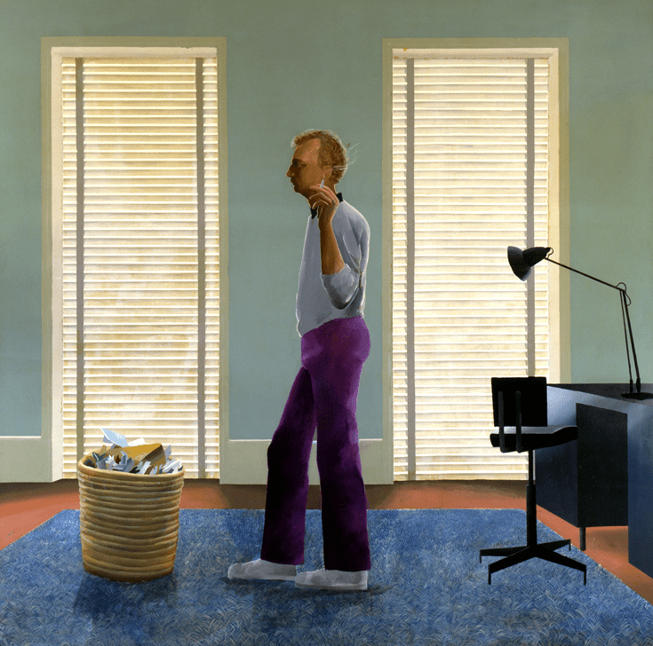
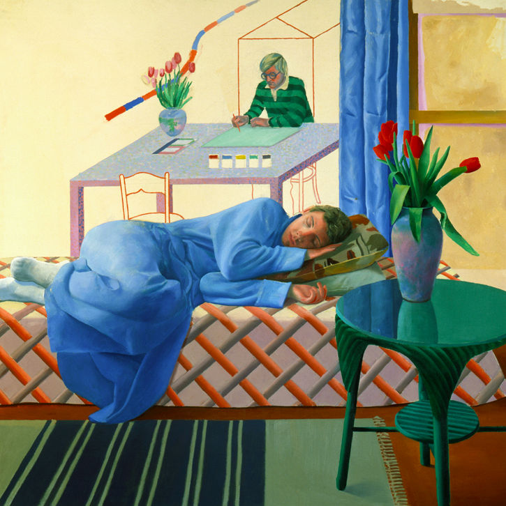
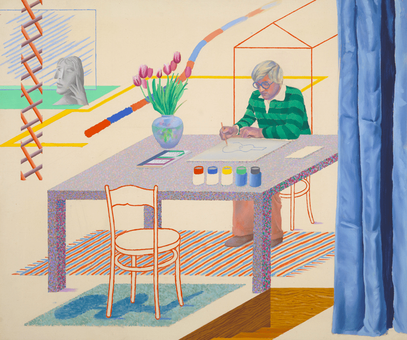
An oeuvre is never finished. So to conclude, we have some visual journeys of renowned artists to illustrate their intriguing development and simultanous consistency over the decades; Mark Rothko, David Hockney, Michaël Borremans, Julie Mehretu, Alexander Tinei, and Remus Grecu.
Mark Rothko, Untitled, ca. 1934. Watercolor on paper – 35.6 × 47 cm. Courtesy Heather James Fine Art.
Mark Rothko, Street Scene, c. 1937. Oil on canvas. Courtesy The Mark Rothko Foundation.
Mark Rothko, Untitled, 1947. Acrylic and oil on canvas – 122.2 × 101.9 cm. Collection
Mark Rothko, Untitled, 1948. Oil on canvas. Courtesy The Mark Rothko Foundation.
Mark Rothko, Number 18, 1951. Oil on canvas – 207 × 177.5 cm. Courtesy Art Resource New York.
Mark Rothko, No. 6 (Violet, Green and Red), 1951.
Mark Rothko, #10, 1952. Oil on canvas – 207.6 × 108 × 5.7 cm. Collection
Mark Rothko, Untitled, 1955. Acrylic and oil on canvas – 232.4 × 150.2 cm. Collection
Mark Rothko, Violet Center, 1955. Oil on Canvas – 176.5 × 102.2 cm. Courtesy Joyce Varvatos.
Mark Rothko, Yellow Band, 1956. Oil on canvas – 218.8 × 201.9 cm. Collection Guggenheim Museum Bilbao.
Mark Rothko, No. 46 (Black, Ochre, Red Over Red), 1957. Oil on canvas – 252.7 × 207 × 4.4 cm. Collection Fondation Louis Vuitton.
Mark Rothko's Seagram Murals (1958) at Tate Modern, London.
Mark Rothko, No. 15, 1957. Oil on canvas – 261.6 × 295.9 cm. Collection Royal Academy of Arts, London.
Mark Rothko, Black on Dark Sienna on Purple, 1960. Oil on canvas – 305.1 × 267.3 cm. Collection MOCA.
Mark Rothko, Orange, Red and Red, 1962. Oil on canvas – 236.5 × 203.5 cm. Collection Dallas Museum of Art.
Mark Rothko, Untitled (Black on Gray), 1969. Acrylic on canvas – 236.2 × 193.4 cm. Collection Anderson Collection at Stanford University.
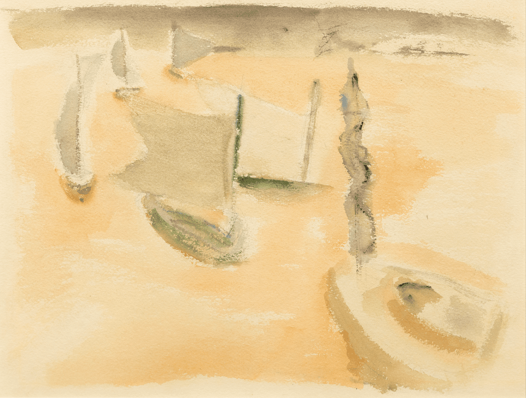
David Hockney, Self Portrait, 1951.
David Hockney, Self Portrait, 1955.
David Hockney, Beverly Hills Housewife, 1966-1967. Acrylic on 2 canvases – 72 x 144 in.
David Hockney, Portrait of Nick Wilder, 1966. Acrylic on canvas – 72 x 72 in.
David Hockney, A Bigger Splash, 1967. Acrylic painting on canvas – 96 x 96 in. Collection Tate, London / The David Hockney Foundation (c)
David Hockney, Portrait of an Artist (Pool with Two Figures), 1972.
David Hockney, Mr. and Ms. Clarck and Percy, 1971. Acrylic on canvas – 84 x 120 in.
David Hockney, Henry Geldzahler and Christopher Scott, 1968. Acrylic on canvas – 84 x 120 in.
David Hockney, Sir David Webster, 1971. Acrylic on canvas – 57 x 72 in.
David Hockney, Christopher Isherwood and Don Bachardy, 1968. Acrylic on canvas – 83 x 119 in.
David Hockney, My Parents and Myself, 1976. Oil on canvas with masking tape – 72 x 72 in. Courtesy and collection David Hockney Foundation (c)
David Hockney, American Collectors (Fred and Marcia Weisman), 1968. Acrylic on canvas – 84 x 120 cm.
David Hockney, Shirley Goldfarb and Gregory Masurovsky, 1974. Acrylic on canvas – 45 x 84 in.
David Hockney, The Room, Manchester Street, 1967. Acrylic on canvas – 96 x 96 in.
David Hockney, George Lawson and Wayne Sleep, 1972-1975. Acrylic on canvas – 80 x 120 cm.
David Hockney, Model with Unfinished Self Portrait, 1977. Oil on canvas – 60 x 60 cm.
David Hockney, Self Portrait with Blue Guitar, 1977. Oil on canvas – 60 x 72 in.
David Hockney, Looking at Pictures on a Screen, 1977. Oil on canvas – 74 x 74 in.
David Hockney, My Parents, 1977. Oil on canvas – 72 x 72 cm.
David Hockney, A Large Diver (Paper Pool 27), 1978. Colored and pressed paper pulp – 72 x 171 in.
David Hockney, Divine, 1979. Acrylic on canvas – 60 x 60 cm.
David Hockney, Santa Monica Boulevard, 1980. Acrylic on canvas – 89 x 242 in.
David Hockney, Hollywood Hills House, 1981-1982. Oil, charcoal and collage on canvas – 60 x 120 cm.
David Hockney, Livingroom at Malibu with view, 1988. Oil on canvas – 24 x 36 in.
David Hockney, Pearblossom Hwy. 11–18th April (Second Version), 1986. Photocollage – 71 x 107 in. Courtesy David Hockney Foundation (c)
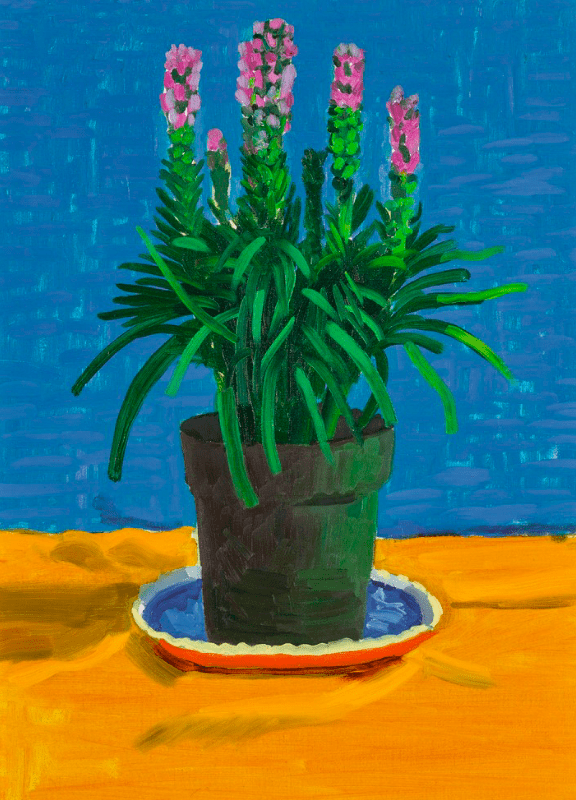
David Hockney, Plant on Yellow Cloth, 1995. Oil on canvas – 66 × 45.7 cm. Photo: Sotheby's / David Hockney Foundation (c)
David Hockney, Small Santa Monica and the Bay from the Mountains, 1990. Oil on canvas – 36 x 72 in.
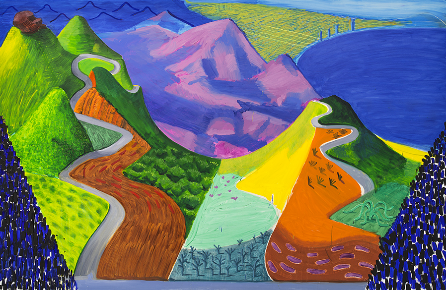
David Hockney, Bigger Trees near Worter, 2007. Oil on canvas – 460 x 1220 cm. Courtesy David Hockney Foundation (c)
David Hockney, The Arrival of Spring, 2011. Courtesy David Hockney Foundation (c)
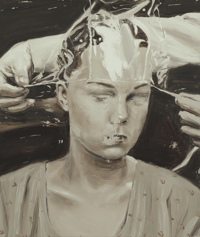
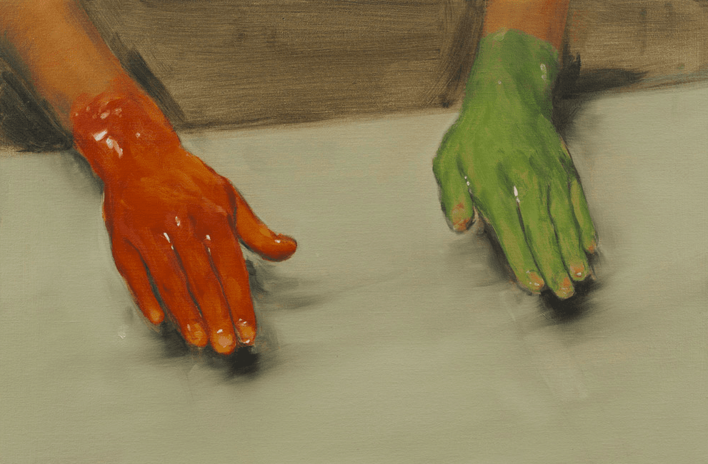
Michaël Borremans, The Preservation, 2001. Oil on canvas – 70 x 60 cm. Courtesy Zeno X Gallery, Antwerp.
Michaël Borremans, A2, 2004. Oil on canvas – 40 x 35 cm. Courtesy Zeno X Gallery, Antwerp.
Michaël Borremans, Mombakkes I, 2007. Oil on canvas – 56,5 x 44,5 cm. Courtesy Zeno X Gallery, Antwerp.
Michaël Borremans, Lakei, 2010. Oil on canvas – 42 x 36 cm. Courtesy Zeno X Gallery, Antwerp.
Michaël Borremans, Red Hand, Green Hand, 2010. Oil on canvas – 40 x 60 cm. Courtesy Zeno X Gallery, Antwerp.
Michaël Borremans, The Loan, 2011. Oil on canvas – 310 x 205 cm. Courtesy Zeno X Gallery, Antwerp.
Michaël Borremans, The Egg IV, 2012. Oil on canvas – 42 x 36 cm. Courtesy of Zeno X Gallery.
Michaël Borremans, The Devil's Dress, 2011. Oil on canvas – 200 x 300 cm. Collection Dallas Museum of Art.
Michaël Borremans, The Son, 2013. Oil on canvas – 36 x 30 cm. Courtesy Zeno X Gallery, Antwerp.
Michaël Borremans, The Angel, 2013. Oil on canvas – 300 x 200 cm. Courtesy Zeno X Gallery, Antwerp.
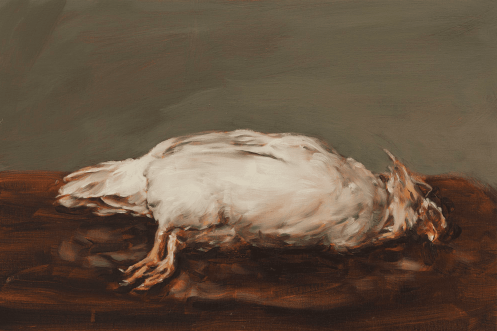
Michaël Borremans, Dead Chicken, 2015. Oil on canvas – 40 x 60 cm. Courtesy Zeno X Gallery, Antwerp.
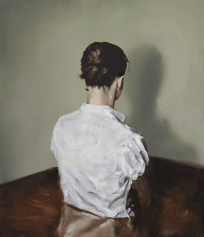
Michaël Borremans, Tracy, 2015. Oil on canvas – 300 x 200 cm. Courtesy Zeno X Gallery, Antwerp.
Michaël Borremans, The Horse, 2015. Oil on canvas – 300 × 386 × 2 cm. Courtesy Zeno X Gallery.
Michaël Borremans, Mercy, 2017. Oil on canvas – 280 x 205 cm. Courtesy Zeno X Gallery, Antwerp.
Michaël Borremans, Amy, 2017. Oil on canvas – 70 x 60 cm. Courtesy Zeno X Gallery, Antwerp.
Michaël Borremans, On the Grind, 2017. Oil on wooden panel – 27 x 35,6 cm. Courtesy Zeno X Gallery, Antwerp.
Michaël Borremans, Fire from the Sun (Four Figures), 2017. Oil on canvas – 174 x 220 cm. Courtesy Zeno X Gallery, Antwerp.
Michaël Borremans, Fire from the Sun, 2017. Oil on canvas – 82 x 65 cm. Courtesy Zeno X Gallery, Antwerp.
Michaël Borremans, The Cheese Sandwich, 2019. Oil on canvas — 80 x 60 cm. Courtesy David Zwirner.
Michaël Borremans, The Pope, 2020. Oil on canvas – 60.2 x 40.2 cm. Courtesy Zeno X Gallery, Antwerp.
Michaël Borremans, Coloured Cones, 2019. Oil on canvas – 88 x 120 cm. Courtesy Zeno X Gallery, Antwerp.
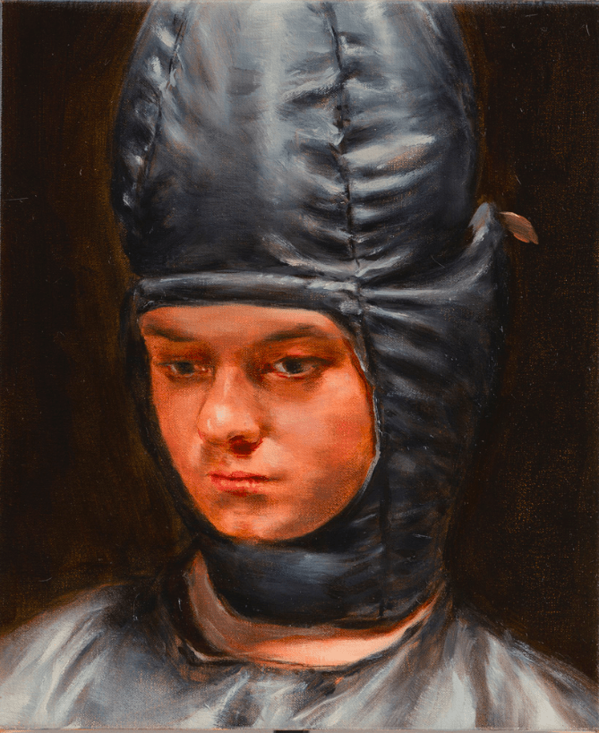
Michaël Borremans, Conehead, 2020. Oil on canvas – 36 x 30 cm. Courtesy Zeno X Gallery.
Julie Mehretu Untitled (two), 1996 Ink and Acrylic on canvas 22 × 18 in | 56 × 45.7 cm
Julie Mehretu Untitled (Court), 1998 Ink and oil on Mylar and vellum 24 × 18 in | 61 × 45.7 cm
Julie Mehretu Looking Back to a Bright New Future, 2003
Julie Mehretu Looking Back to a Bright New Future, 2003
Julie Mehretu Stadia I, 2004 Ink and acrylic on canvas 107 × 140 in | 271.8 × 355.6 cm
Julie Mehretu Reflections on the Weight, 2008 84 × 120 in | 213.4 × 304.8 cm
Julie Mehretu Cairo, 2013 Ink and acrylic on canvas 120 × 288 in | 304.8 × 731.5 cm
Julie Mehretu Campaign (letter form, second), 2014 Ink and Acrylic on canvas 60 × 72 in | 152.4 × 182.9 cm
Julie Mehretu Invisible Sun (algorithm 7, spell form), 2015 Ink and Acrylic on canvas 119 7/10 × 167 in | 304 × 424.2 cm
Julie Mehretu HOWL, eon (I, II), 2016-2017 Ink and acrylic on canvas 324 × 384 in | 823 × 975.4 cm
Julie Mehretu Mumbaphilia (J.E.), 2018 Ink and acrylic on canvas 96 × 72 in | 243.8 × 182.9 cm
Julie Mehretu Hineni (E. 3:4), 2018 Ink and acrylic on canvas 96 × 120 in | 243.8 × 304.8 cm
Julie Mehretu Sun Ship (J.C.), 2018 Ink and acrylic on canvas 108 × 120 in | 274.3 × 304.8 cm
Julie Mehretu Host (Bolsonaro eve), 2019-20 Ink and acrylic on canvas 48 1/4 × 100 3/16 in | 122.6 × 254.5 cm
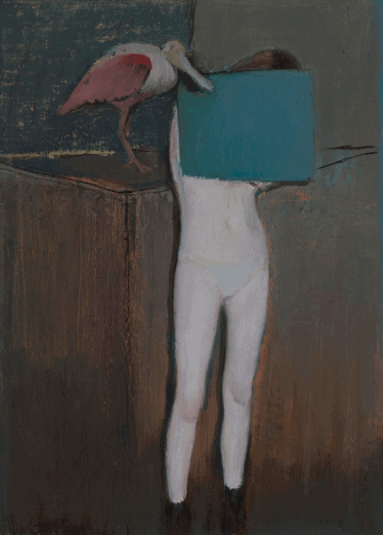
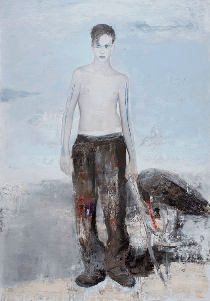
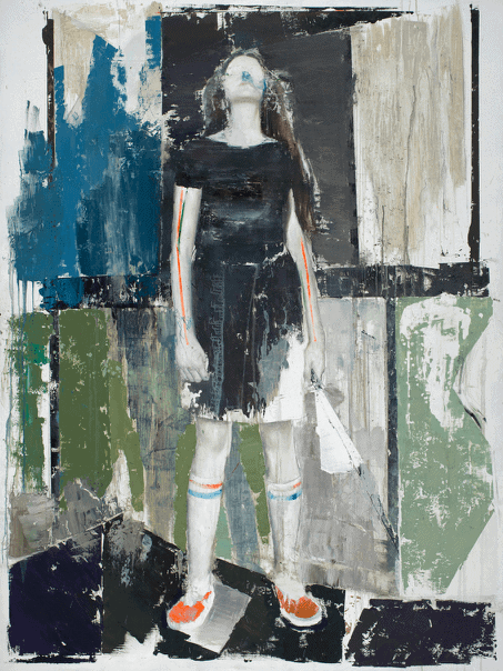
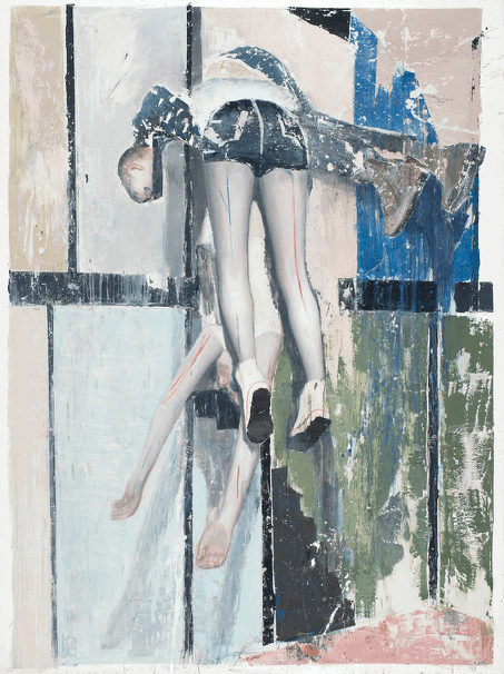
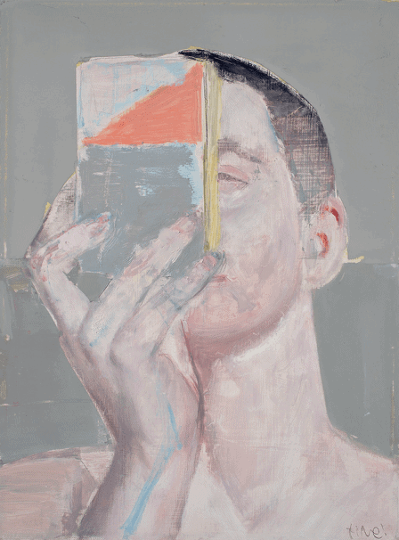
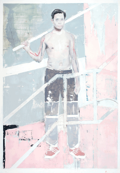
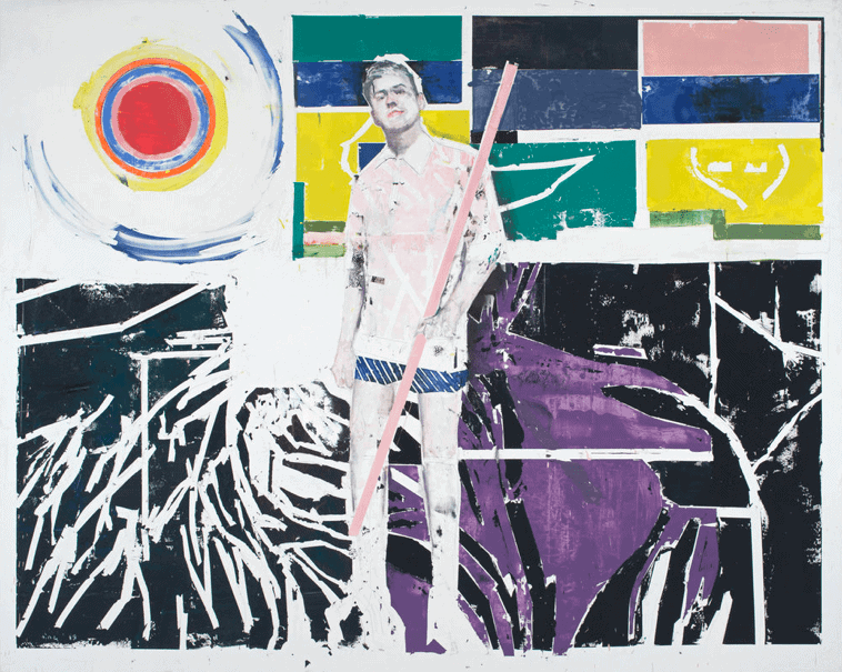
Alexander Tinei, Mask, 2008. Oil on canvas — 120 x 100 cm. Courtesy of the artist.
Alexander Tinei, Light, 2009. Oil on canvas — 100 x 80 cm. Courtesy of the artist.
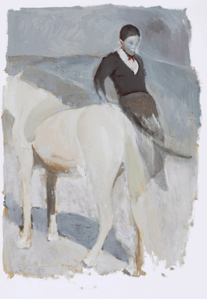
Alexander Tinei, Sitting figure, 2010. Oil on canvas — 80 x 100 cm. Courtesy of the artist.
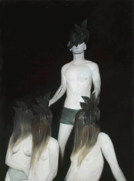
Alexander Tinei, Nymphs, 2011. Oil on canvas — 200 x 150 cm. Courtesy of the artist.
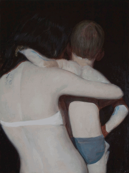
Alexander Tinei, Mother and child, 2012. Oil on canvas — 80 x 60 cm. Courtesy of the artist.
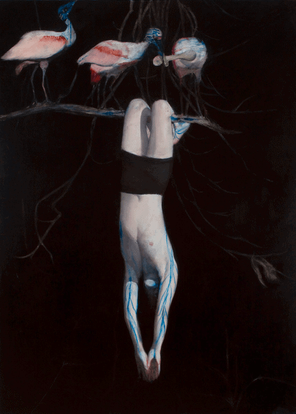
Alexander Tinei, Birds, 2012. Oil on canvas — 240 x 180 cm.
Alexander Tinei, Horse, 2013. Oil on paper — 64 x 44 cm. Courtesy of the artist.
Alexander Tinei, Bird, 2013. Oil on canvas — 52 x 48 cm. Courtesy of the artist.
Alexander Tinei, Untitled, 2014. Oil on paper — 34 x 28 cm. Courtesy of the artist and Galeria Doris Ghetta.
Alexander Tinei, Untitled, 2015. Oil on paper — 68.7 x 60.5 cm. Courtesy of the artist.
Alexander Tinei, Girl with an axe, 2015-2016. Oil on canvas — 200 x 140 cm. Courtesy of the artist.
Alexander Tinei, Boy with a stick, 2015-2016. Oil on canvas — 200 x 140 cm. Courtesy of the artist.
Alexander Tinei, Fille à l'éventail, 2016. Oil on canvas — 200 x 150 cm. Courtesy of the artist and Galerie Dukan.
Alexander Tinei, Social experience, 2017. Oil on canvas — 270 x 200 cm. Courtesy of the artist and Galerie Dukan.
Alexander Tinei, Paper box, 2017. Oil on canvas — 40 x 30 cm. Courtesy of the artist.
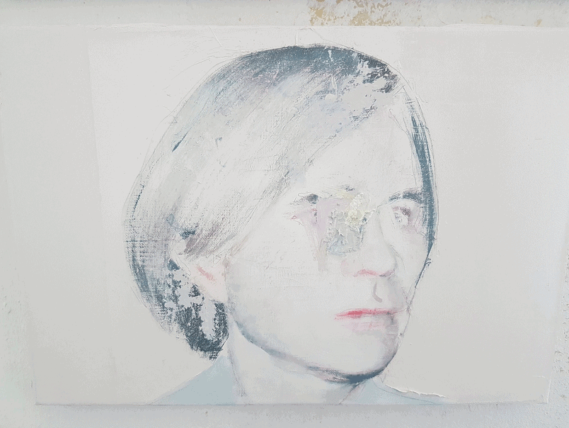
Alexander Tinei, Portrait of a boy, 2017. Oil on canvas — 45 x 35 cm. Courtesy of the artist and Déak Erika Galéria.
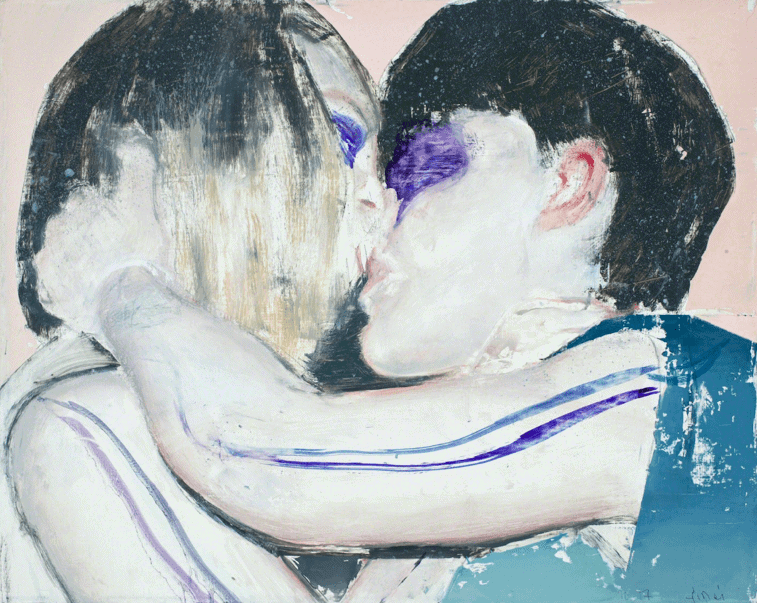
Alexander Tinei, Kiss, 2017. Oil on canvas — 40 x 50 cm. Courtesy of the artist and Galerie Dukan.
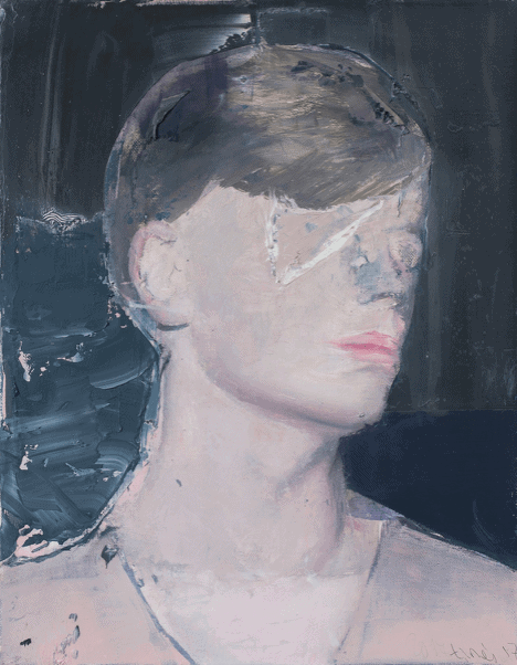
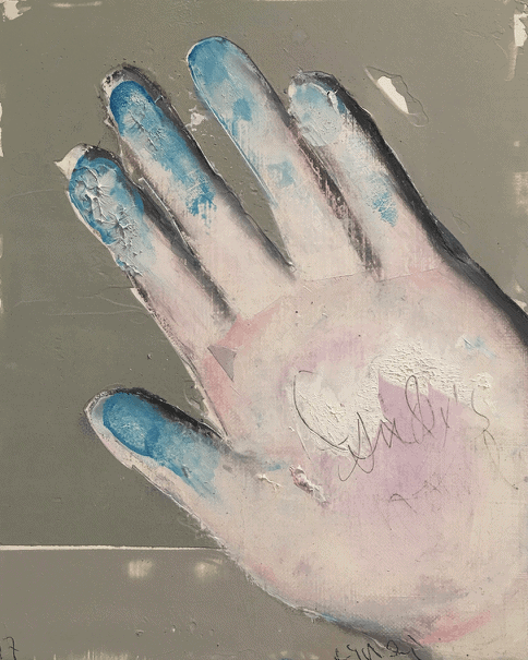
Alexander Tinei, Andy's hand, 2017. Oil and acrylic on canvas — 25 x 20 cm. Courtesy of the artist and Déak Erika Galéria.
Alexander Tinei, Warhol, 2017. Oil on canvas — 30 x 40 cm. Courtesy of the artist and Déak Erika Galéria.
Alexander Tinei, Boy with a stick, 2016-2018. Oil on canvas — 200 x 140 cm. Courtesy of the artist.
Alexander Tinei, Kiss, 2018. Oil on cardboard — 139 x 93 cm. Courtesy of the artist.
Alexander Tinei, Head in colors, 2018. Oil and collage on cardboard — 48 x 40 cm. Courtesy of the artist and Galeria Doris Ghetta.
Alexander Tinei, Measuring the roots, 2019. Oil on canvas — 200 x 250 cm. Courtesy of the artist and Galeria Doris Ghetta.
Alexander Tinei, Kiss, 2019. Oil on canvas — 140 x 100 cm. Courtesy of the artist and Galeria Doris Ghetta.
Alexander Tinei, Fields, 2020. Oil on canvas — 50 x 40 cm. Courtesy of the artist.
Alexander Tinei, Picasso’s Bull, 2019-2020. Oil on canvas – 214 x 214 cm.
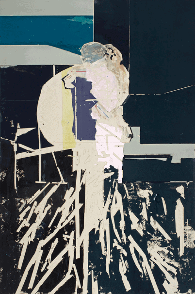
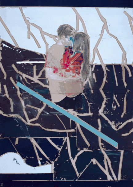
Remus Grecu, Naked liberty, 2015. Oil on linen – 143 x 140 cm. Courtesy CAI Gallery.
Remus Grecu, Soul thieves, 2013. Oil on linen – 143 x 124 cm. Courtesy CAI Gallery.
Remus Grecu, Satyagraha, 2017. Oil on linen – 73 x 57 cm. Courtesy CAI Gallery.
Remus Grecu, Ecce homo, 2017. Oil on linen — 269 x 168 cm / 107.5 x 67 in
Remus Grecu, The Gleaners, 2019. Oil on linen — 150 x 135 cm / 60 x 54 in
Remus Grecu, Veiled Mistakes, 2020. Oil on linen – 110 x 80 cm. Courtesy CAI Gallery.
Remus Grecu, Untitled, 2021. Oil on canvas — 75 × 260 cm / 108 × 102 in
Summery winter, oil on linen, 2022, 202 x 144 cm
Remus Grecu, The Unicorn, 2022. Oil on linen — 158 x 108 cm / 63 x 43 in
Julien Delagrange (b. 1994, BE) is an art historian, contemporary artist, and the director of CAI and CAI Gallery. Previously, Delagrange has worked for the Centre for Fine Arts (BOZAR) in Brussels, the Jan Vercruysse Foundation, and the Ghent University Library. His artistic practice and written art criticism are strongly intertwined, examining contemporary art in search of new perspectives in the art world.